Packaging: tales from the front line of branding
Share
Susi Banks chats to those in the know about packaging design and finds that what was once just a vehicle for distribution can now be a brand’s sharpest weapon.
In 1989 Streets launched Homer Hudson ice-cream in Australia, but positioned it as an independent premier boutique brand – which could charge a premium price. Apart from readers of the marketing trade press, no punter would have had a clue this was a Streets product.
Of course, nowadays, consumers are savvier – and cynical – and wouldn’t be at all surprised by such a practice. Consequently, the methods used have become much more sophisticated in the never-ending battle for marketers to stay one step ahead of consumers.
A pack a day
Gwen Blake of packaging design consultancy Boxer & Co says (unsurprisingly) that packaging is the single most important brand component. Blake, who has written a book about pack design (Packaging a Punch) says brands have less than seven seconds to get the consumer to notice their product on the shelf.
She illustrates what power a pack design can possess by talking about how often, after purchase, consumers are getting a reinforced message from the packaging. “It’s the piece of the brand that the consumer selects from the shelf, takes home, unpacks, selects a spot for in their home, then repeatedly picks up and uses again and again, before returning to the supermarket to re-purchase.
“A cereal pack will sit on breakfast tables, day after day. A laundry powder box will sit on top of a washing machine and get picked up and used repeatedly during its life,” Blake says.
“These simple pieces of cardboard form part of the landscape of the household and are, over time, scrutinised by the consumer without their even realising it. Because of the unique, tangible nature of the pack, we call it ‘the brand in the hand’. The repetition of viewing and interacting with it again and again plants it firmly in the consumer’s mind and gives it its marketing super-powers,” she says.
Blake wrote her book to help entrepreneurs and start-ups to navigate the complicated world of packaging design. Although there’s much information that will also benefit brand managers at big companies in the book, Blake and her business partners found that they were increasingly approached by entrepreneurs who wanted to launch their own products. “[Entrepreneurs] each have an incredible and unique skill set, but don’t necessarily have the marketing and design experience that the marketing employees in large corporates have,” she says.
The book teaches everything from common jargon used when designing and creating packaging, to what colours and typefaces to use, right down to giving feedback to your packaging designer to get the best possible results. So if you think ‘romance copy’ refers to the description on the back of a Mills and Boon novel, you will learn that it actually is the copy on the back of a pack that tells you something more about the product, like the story of your brand or the values that it stands for. The romance copy is designed to tip the swayer over the line – with imagery and aspirational desires.
Semiotics
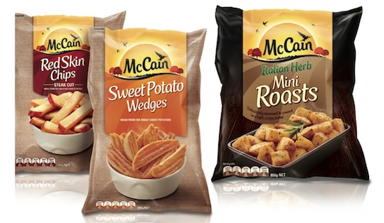
Nir Wegrzyn, founding partner and CEO of BrandOpus, a London-based strategic design agency that opened a Melbourne office in 2012, says his company uses semiotics as a valuable branding tool to the benefit of its clients. “McCain’s new identity, for example – the first change in over 50 years – has shifted perceptions of the brand away
from the freezer section to a warmth and naturalness previously unassociated with the brand, through the harnessing of semiotics in the design process,” says Wegrzyn.
In the simplest of terms, semiotics is the study of how people interpret signs and symbols. The word itself is from the Greek word semeon, meaning ‘observant of signs’.
“Semiotics creates a way of understanding how everything we see is interpreted unconsciously by us, decoding the meaning we derive from symbols around us,” Wegrzyn says. “We are all semioticians, because unconsciously we are constantly interpreting the meaning of signs around us.
“And we need to understand the context in which a sign is communicating in order to comprehend the actual meaning that people take from it, and how they behave because of it.”
If you’ve ever gone to the supermarket to buy a particular deodorant or shampoo that you’ve used ‘forever’, but can’t find it, you’ll know how annoying it can be. It’s a hassle trying to find a product you’ve used for years that you’ve pretty much taken for granted. This minor inconvenience for consumers can be a major hassle for brands when changes to packaging are considered, as it can equate to millions of dollars in lost sales.
When a product’s packaging is changed often, the item disappears off the supermarket’s shelves for a period of time and, for essential items, consumers are forced to try a different product, often by a competing brand. Even worse, when the original product returns, the customer may actually prefer the product they chose in the interim. They don’t recognise the new product as they have stopped looking for it, and this can have a huge impact on a FMCG brand’s bottom line.
Jaid Hulsbosch, director at Sydney design company Hulsbosch, says the impact when a brand changes the name or packaging of a product can be huge.
“The biggest fear of a Unilever or a P&G is that if they change anything relating to packaging, consumers might not find their product because they don’t recognise it on shelf,” he says. “If consumers can’t easily find their products among the sea of other brands on supermarket shelves, they might lose a sale,” says Hulsbosch.
He cites the example of a pack redesign in 2009 of Tropicana Pure Premium Juice. “Sales plummeted 20% between 1 January and 22 February, costing the brand tens of millions of dollars.
“On 23 February 2009 the company announced it would bow to consumer demand and scrap the new packaging. It had been on the market less than two months. [It’s] probably a little known fact, but consumers were clear they were passionate about their juice choice!”
Hulsbosch (the company) has long-established credentials in packaging design, having launched potato chip brand Thins into the market in 1994 for Frito-Lay. The identity and pack design have evolved over time to make them more contemporary and desirable. Hulsbosch had a successful partnership with Thins for over 11 years, winning many national and international awards for the brand.
Enter the ‘pseudo brand’
Mark Haygarth, creative director at Boxer and Co, and Gwen Blake’s business partner, points to the rise – and rise – of private label brands and packaging. Haygarth says private label is upping its game.
“Gone are the days when private label packaging needed to mimic their branded counterparts to gain a piece of the pie. Gone, also, are the days when the packaging needed- simply to be a functional pack, void of any real emotion.
“Globally, there are some instances that private label packaging is leaping over its branded counterparts in terms of innovation and creativity,” Haygarth says.
He believes that there are, however, categories in which private label has had its challenges. “Would you really trust a supermarket to produce a convincing range of beauty products?” Haygarth asks. “Enter the pseudo brand. Supermarkets now create their own brands to combat this concern. These brands live and breathe like actual brands engaging and delighting consumers.”
He says a good example of this is the UK supermarket chain Sainsbury’s Active Naturals range, which, when launched, took its cues from what was happening in the world of herbal apothecaries.
Disruptive visual codes
Global brand consulting company, Landor, recently held an event in Melbourne, titled ‘Breakthrough Packaging’, in which the message was simple: win the eye, then the heart, then the mind.
In some highlights from the presentation, creative director of Landor Melbourne, Chris Reay, talked about the top five pieces of breakthrough packaging (see breakout).
Says Reay: “I think we are reaching a new age of disruption in the design industry. Over the past five years we’ve noticed a shift in the language of briefs where once ‘stand-out on shelf’ was merely part of a long list of ‘design considerations’. Now clients are actively seeking to disrupt categories and define new visual codes.
“The rise in smaller and more entrepreneurial companies, as well as a growing world of visual clutter, is driving this disruptive trend.”
The Australian sausage company Beak and Sons has been producing gourmet, preservative-free sausages for over 70 years. The company’s main lines are the two sausage varieties: ‘the original’ and ‘smoky chorizo’. It also makes a ‘classic burger’ and ‘classic meatball’. The company recently rebranded, changing its name from Mr Beak’s.
Beak and Sons can trace its heritage back to the 1890s when Reggie Beak visited Spain and became hooked on the mouthwatering classic chorizo. Upon his return, he set about creating his own, and the rest – as the company says on its website – is history.
Brand manager Lisa White says the goal of the rebranding was to establish Beak and Sons as a premium gourmet sausage and to achieve greater stand-out on shelf and therefore drive an increase in sales. “With all rebranding, there is the concern that loyal consumers will not follow to the new brand, which is why we maintained elements from the existing brand, [such as changing] Mr Beak’s to Beak and Sons,” says White.
“Qualitative market research was undertaken to fully understand the perception of Mr Beak’s among users and non-users. Consumers were asked for their opinions on a range of options for new packaging and their feedback was used to optimise the new pack design,” she says.
Green in more than colour
But what about the environment? A fair enough question when you think of the millions of packaging cartons produced each year. The Australian Packaging Covenant (APC) is a sustainable packaging initiative that aims to change the culture of business to design more sustainable packaging, increase recycling rates and reduce packaging litter.
The APC has over 900 signatories, representing 90% of all packaging produced and over 80% of all packaged consumer brands sold in Australia. It also publishes an annual report that outlines what has been achieved over the previous year through industry, government and community groups working collaboratively to increase recycling and reduce litter.
When an organisation signs to the Covenant, it is required to develop an action plan that details the actions it will undertake to contribute to the Covenant’s three goals: design, recycling and product stewardship. Each year signatories report against their action plans and their reports are independently assessed and rated.
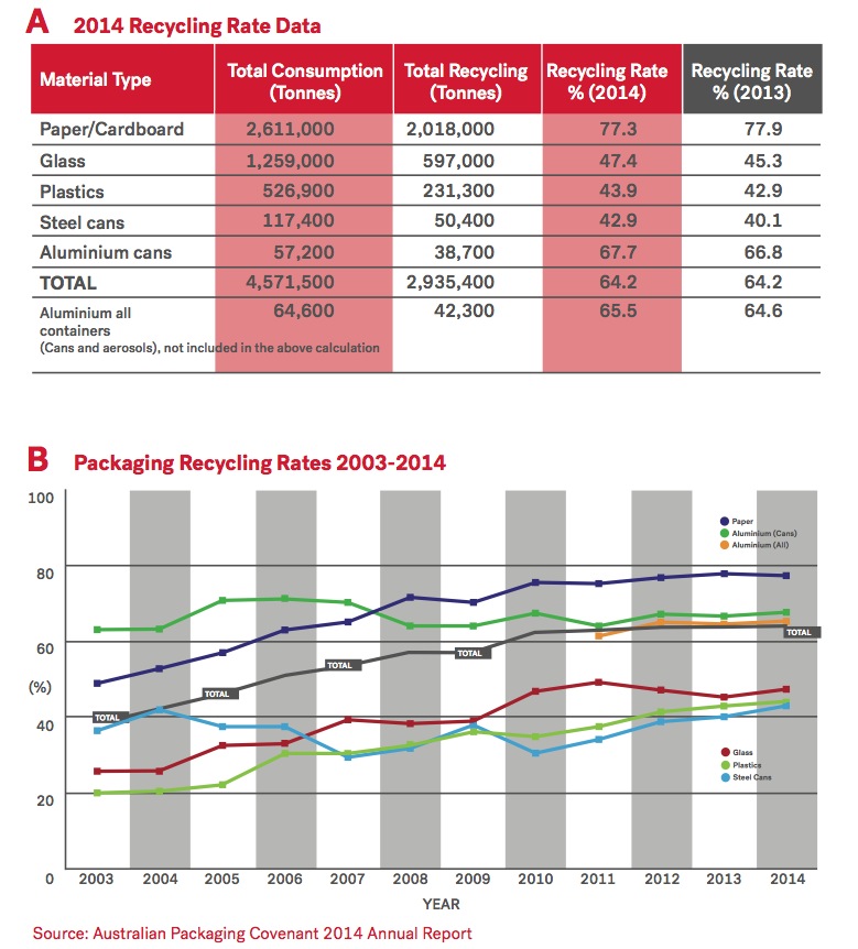
In terms of recycling in Australia, paper and cardboard score the highest, as demonstrated by figures published by the APC’s 2014 Annual Report.
Out of a whopping total consumption of 2,611,000 tonnes, 77.3% – or 2,081,000 tonnes – was recycled. (See above figures.)
Aluminium cans were next, with 66.8% being recycled. Glass, plastics and steel cans all averaged around 43% in terms of recycling.
The APC regularly funds initiatives such as the Keep Australia Beautiful National Litter index (NLI). The NLI is Australia’s only national quantities measure of what litter occurs, where and in what volume, based on counts taken in November and May during the reporting period.
The APC’s high performing signatories include Blackmores, Coca-Cola, Campbell Arnott’s and McDonald’s. Signatories also make a yearly financial contribution, which the APC reinvests into litter and recycling by funding projects that contribute to the Covenant’s aims.
“Brand owners have expressed a growing appreciation of the value of the services being delivered to them beyond compliance,” wrote Australian Packaging Covenant chair, Alec Wagstaff, in the 2014 annual report.
“A suite of programs and activities has been delivered during this past year, which have been well-received and which ultimately help to change the culture of business to design more sustainable packaging, to increase packaging recycling and to reduce packaging litter.”
As at 30 June 2014, the APC managed a portfolio of 35 live projects representing $6.1 million in APC funding, with a combined total project value of over $16 million.
Internationally, as well as in Australia, much is being done to promote paper’s credentials as a packaging medium, as it is renewable and recyclable. With several certified audit- able and well-established international forest certification schemes, paper is now produced by an environmentally conscious industry, the future of which depends on planting more trees than it consumes.
Australia’s planted forests have doubled in size from one million hectares in 1994 to two million hectares in 2010 and they absorb more greenhouse gases from the atmosphere than they release. Therefore they help to offset Australia’s contribution to global greenhouse gas emissions. (Source: Sam Upton, Print Power UK, 2013).
Click chart to enlarge.
Top five: Best breakthrough packaging
Chosen by Landor’s Chris Reay.
Brewdog
“Brewdog’s End of History reminds us that anything really does go and, in our ever-evolving and more creative world, if you want to sell beer in stuffed animals then do it and you’ll see that the only thing that limits you is your own imagination.”
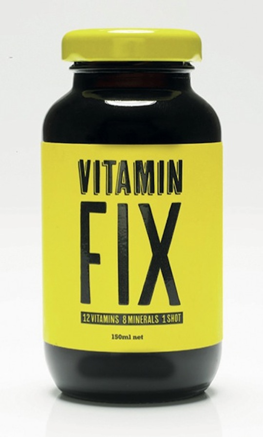
Vitamin Fix
“Seems to be the cure we’ve all been looking for. No more timely and expensive green smoothies to make each morning… just one shot and we can eat what we want during the day safe in the knowledge we’ve got everything our body needs. Well not quite, but the growing awareness that other vitamin waters may be lolly water only serves to make this new little product feel more authentic. Tapping into the codes of the classic medicine bottle is a smart move. This may not be the complete answer, but it’s definitely the brief for the future.”
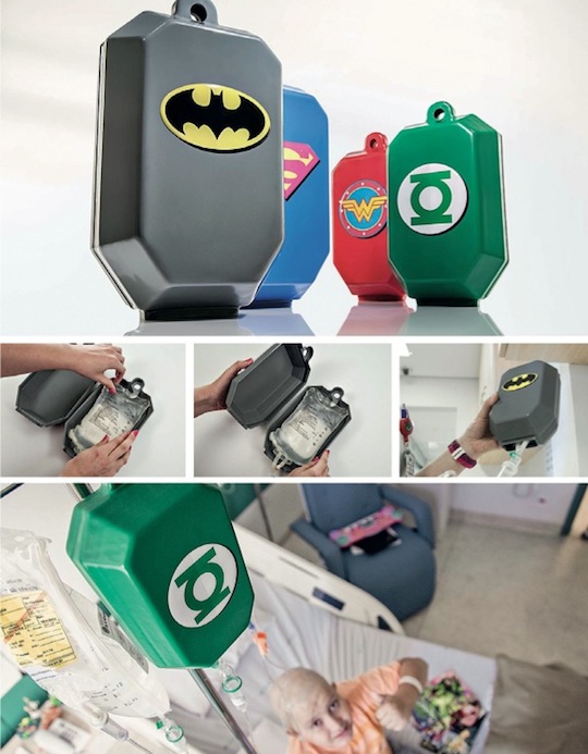
Superformula
“We talk a lot in our industry about connecting with consumers emotionally, but no piece of packaging has ever done it quite to the extent of Superformula. It’s a simple plastic container for chemotherapy branded with superhero iconography that helps change the negative perception of the treatment for children in Brazil. The covers were given more meaning with specially designed comic books where the superheroes suffer similar trauma, but are brought back to full strength using Superformula.”
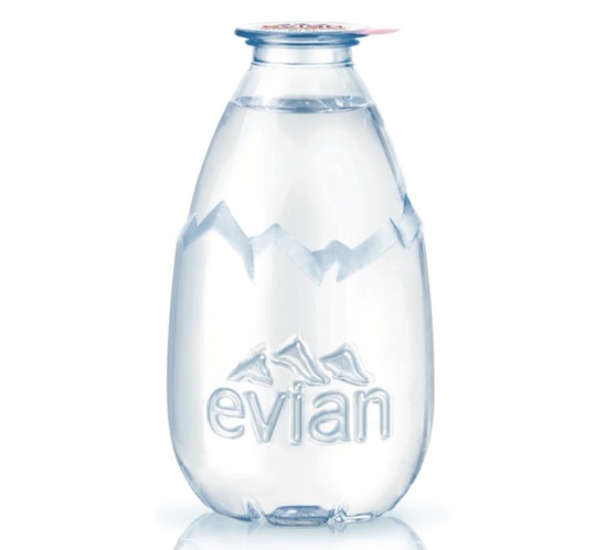
Evian’s Pure Drop
“Bottled water is a category that is pretty hard to reinvent yourself in and where innovation is pretty much restricted to format or distribution. The new 20cl Evian Pure Drop bottle aims to create a new ritual of consumption blended with stunningly chic design.”
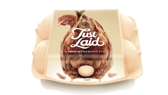
Just Laid
“Communicating freshness in an unexpected and disruptive way. The simplest ideas are always the best.”