TOM Organic packaging redesign: taking eco-chic mainstream
Share
Campaign: TOM Organic packaging redesign
Client: TOM Organic
Agency: Truly Deeply
Background
The first and only range of feminine hygiene products accredited by the Australian Certified Organic organisation, TOM products are all 100 percent biodegradable, made entirely from organic cotton and free from chemicals, bleaches and synthetics. Previously, they were only available in selected independent stores. TOM Organic was founded on the belief that women in the world should be able to thrive on every front. They should feel empowered to pursue their dreams with a sense of optimism and empowerment.
They should never have to compromise their physical or emotional well-being through exposure to toxic products or thoughts. The joy of life should be a natural wonder that every woman in the world gets to experience.
Despite the huge level of competition in the feminine hygiene category in Australia, founder Aimee Marks believed that there was an opportunity for TOM to step outside the organic market and appeal to a wider commercial audience. Due to the high price point of the TOM range, in order to be competitive, TOM Organic needed to educate consumers on the benefits of organic and build an emotional connection with its audience.
The redesign of the TOM Organic packaging was part of a larger repositioning of the TOM Organic brand. TOM was Australia’s leading brand of organic feminine hygiene products, but had an insignificant share of market and distribution. Our task was to refocus the brand, repositioning TOM to the mainstream end of the organic market, broadening its appeal and brand awareness. One of the strongest and most relevant trends in organics is ‘eco chic’. The design of the packaging was crafted to connect with this movement where elegance and sustainability walk hand in hand.
The visual language of the pack graphics and the brand storytelling were designed to not only provide a standout presence on-shelf, but also to communicate TOM’s proposition to build a greater understanding and awareness of the brand.
Objectives
The objectives of the TOM packaging redesign were threefold:
- to help effectively communicate the benefits of using organic feminine hygiene products to increase the brand’s perceived value in order to justify a price premium,
- to bring to life the genuine ‘eco chic’ credentials, spirit and personality of TOM, and
- to spark an emotional connection with a wider audience.
Strategy
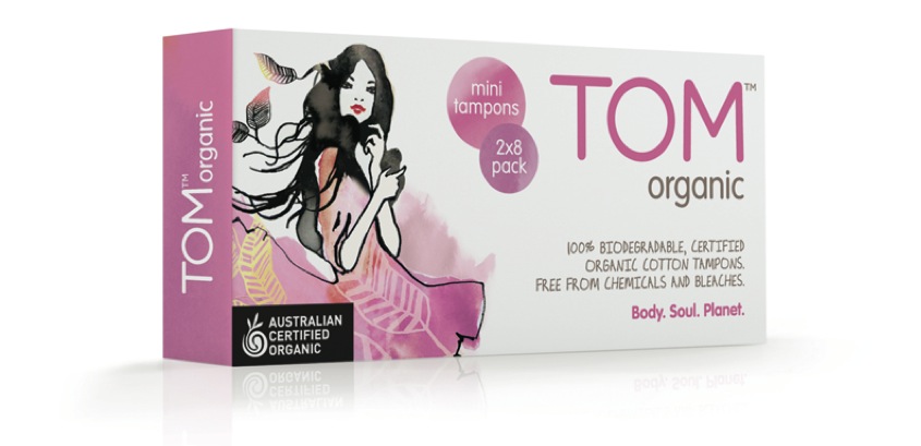
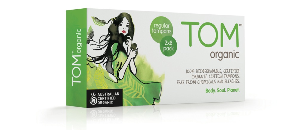
Truly Deeply worked closely with founder Aimee Marks to define and bring to life the genuine ‘eco chic’ credibility, spirit and personality of TOM. Through a brand definition process, re-tweak of the TOM brand identity and a fresh packaging design story, Truly Deeply transformed TOM’s on-shelf presence into a glowing, confident brand. The visual language of the packaging design is further supported by layers of evocative brand storytelling that illustrates Marks’ commitment to walking the talk as the category’s leader in environmental sustainability.
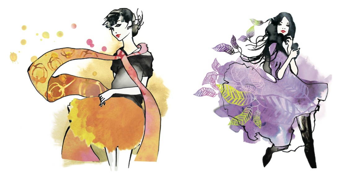
A series of illustrations were crafted specifically for the packaging by Sydney-based artist Sarah Carter-Jenkins. The TOM range has been extended to six products – mini, regular and super tampons, day and night pads, and liners – each featuring a unique colour and illustration design that together create a strong story on-shelf. The colour, typography and textures along with the custom illustrations have been carefully crafted to communicate the ‘eco chic’ positioning of the brand, as well as connect with the target market: the stylish, modern young woman.
Execution
The new TOM visual identity design was launched across six SKUs (stock keeping units): mini, regular and super tampons, day and night pads, and liners. Each SKU had its own unique and handcrafted illustration with TOM visual language altered on-pack to give each product a life of its own within the TOM organic family.
The brand’s presence on-shelf is driven by a differentiating design strategy. The leading brands in the market bombard consumers with a consistently chaotic visual language.
TOM’s packaging is intentionally stylish and elegant with a sophisticated environmental edge. The visual language stands out by adopting the cues of fashion semiotics, rather than mimicking the look of the market leaders.
Results
The new pack design was the critical factor in TOM Organic’s product range being picked up by national retail chain Chemist Warehouse, and then by Woolworths throughout Australia.
“As a direct result of the TOM Organic brand repositioning and packaging range redesign, we have been stocked by Woolworths supermarkets nationally. As these significant changes to our supply chain are in the early stage, we’ve been unable to accurately assess the resultant increase in market share and revenues, but we are predicting they will be of the magnitude of 1000% in six months – significantly impacting our whole business positively,” says Aimee Marks, founder of TOM Organic.
The appearance of TOM Organic on the shelves of Woolworths supermarkets nationally has been the catalyst for the creation of a new category, which is expected to represent a significant market share.
At the Packaging Council of Australia’s 2012 Australian Packaging Design Awards, Truly Deeply was awarded gold in the ‘Health and beauty’ category for the TOM Organic packaging redesign.
Did you know: you can see all of Marketing’s highly-transparent case studies first and with stunning high-resolution glossy photography by becoming a subscriber? It’s only AU$45 for a whole year, delivered straight to your door. Find out more »


