

Shortcomings of Sochi 2014 branding hint at deeper issues with Russia’s country brand
Share
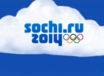
The brand identity for Sochi 2014 eschews the usual symbol or brand mark in favour of a purely typographical logo. It has been criticised for lacking personality, but that may just be because Russia is still trying to figure out its own post-Cold War identity.
We spoke to Tim Riches, managing director of Designworks Australia, about Games branding, and Sochi in particular.
“Olympic games brands are unique branding challenges, because they are a hybrid of the country brand and Brand Olympics and there’s always a balancing act that has to deliver for both of those,” says
Riches was involved with the branding of Sydney 2000, the Melbourne 2006 Commonwealth Games, the Melbourne 2007 FINA World Swimming Championships and FIFA World Cup host country bids for Australia and South Korea.
We asked Riches if it is even appropriate for outsiders to judge Games brands such as Sochi, with Games in a sense being the host country’s own celebration.
“No, I don’t think that’s right,” says Riches, “because if I am the host country, the value proposition of the Olympics is for the host country to be in the international spotlight, and so it absolutely is an exercise in marketing the country to its export markets, whether that be for tourism or other aspects of the economy.
“It absolutely should be held up and judged. It should be judged from the point of view of whether it will be effective in driving demand for that country. It’s not an act of artistic self expression on the part of the host country and certainly shouldn’t be seen as that. It should be seen as an investment in the desirability and prestige of the host country’s brand.”
Riches’ main criticism of the Sochi 2014 brand identity is that it lacks personality. That issue hints at deeper challenges in Russia as a brand itself.
“When you look at the Sochi identity, one thing that’s attracted a lot of comment is that the actual logo is a word mark, there’s not a symbol there per se.
“That is unusual, because normally there is [a symbol] in the logo, a more expressive visual element, or more personality-driven typography that expresses more about the host country.
The secondary elements, though, are impressive. “There’s quite a strong secondary palette of pattern elements, which you see on things like the bibs that the competitors wear and in some of the field of play branding, on merchandise and those sort of things, he says.
“It’s that diamond pattern that looks a little bit like a diamond lattice which is often filled with a pattern, which I think is quite beautiful, and is based on traditional craft, painted porcelain, I believe. It’s been built out into that diamond pattern which is used quite flexibly.”
That does a number of jobs from a design point of view, giving flexibility of elements. But, the problem remains, the logotype is often on its own. “The problem is still, in my opinion, that the main brand mark itself is too absent of personality… When you see the brand mark standing alone I don’t think it delivers you very much. You don’t get a sense of who Russians are, of the lifestyle, or what that experience is like.”
It’s a slightly strange decision, Riches says, because it was an opportunity for Russia to define itself in a big way.
“Since the dissipation of the Soviet Union, when you look at Russia through the lens of country brands, how defined is Russia now? I don’t think it’s very clear. Lots of former Soviet countries are still forming their identity, thinking about how to present themselves to the world, and Russia is a good example of that, and that’s why [the vague brand personality of Sochi] surprises me.”
“In contrast to where we’re at with Sochi, I think Beijing was a much stronger statement of country brand China than Sochi is for country brand Russia.”
“But at least in China there’s a visual and cultural identity for China that’s more discernible globally for China than there is for Russia. Even some of the sponsorship campaigns for Beijing draw on it… that expressed a lot about the Chinese culture of excellence.
“For Sochi it’s a bit harder to know what to say about Russia in that global spotlight.
One of the problems, says Riches, is that a lot of the traditional and cultural symbols one might associate with Russia, such as Motryoshka dolls, Saint Basil’s Cathedral, have political and cultural baggage attached to them. “There’s orthodox Russian art, which is problematic, and things like the Kremlin. There’s that architecture which is perhaps recognisable, but there is a visual language of Soviet-era heroic statues, propaganda art, which are quite identifiable, but are problematic for political reasons.”
Maybe, he says, the difficulty in choosing what they would want to put forward is precisely why the Sochi brand team went for a logo that doesn’t have a symbol in it. “Maybe it’s just too hard to settle on what that should be, because it’s still a story that’s forming.”
It’s a missed opportunity. “But I can see why perhaps it was a hard one for them.”


