Creative showcase: promotional products
Share
This creative showcase was first published in the February 2012 issue of Marketing magazine.
Mention promotional products and pens, note pads and the occasional thumb-drive springs to mind. We showcase new ways that marketers are putting their brands out to the market and get our expert panel to rate their performance.
The panel:
 William Kestin
CEO, Australasian Promotional Products Association; Vice president, International Federation of Promotional Products Associations
 David Lo
CEO, The Marketing Zoo; Executive chairman, Australasian Promotional Marketing Association
 Dorry Kordahi
Joint CEO, DKM Blue …………………………………………………………………………………..
 Robert Taylor
Operations manager, Superior Activewear
The products:
1. VB
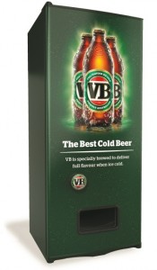
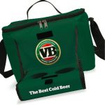
For the ‘best cold gear’ summer promotion, VB is rewarding drinkers with the chance to redeem on-pack codes for a series of world-first innovations designed to help beer drinkers drink their VB at its optimum temperature: ice cold. VB is working closely with Buzz Marketing, Droga5 and Apollo Marketing to design unique promotional items exclusive to VB. The prizes for this summer include the VB vending machine that dispenses ice cold VB stubbies, the VB thermo cooler with an in-built thermometer and LCD screen, the VB ice cold alarm to prevent accidents of frozen beer, and the VB ice box, a limited-edition carton that is 100% waterproof and designed to hold ice.
WK: I found the usefulness of the products to be appropriate for the target market. A nice combination of new technology reinventing some fairly standard products. I thought the consistency of the branding was well applied and liked the fact that it wasn’t ‘over branded’. Good solid promotion, but would have liked to see a bit more interaction in the roll- out. Besides that, I guess if you ever over-do it on the VB, you can use the cooler for any necessary organ transplant emergencies! Like it!
DL: Talk about owning cold beer this summer! From chilling your brews in the freezer (and not forgetting to get them out before they blow) to keeping them icy cold for hours in the hot sun, VB’s single-mindedness to be ‘the best cold beer’ is literally refreshing. For all true blue Aussie blokes who don’t enjoy warm beer, every promotional item they’re offering has great utility and will be highly desirable for the target audience. I’m sure a lot of blokes out there will be downing a whole lot of VB to get their hands on them. I want that fridge. Nice teamwork Buzz, Droga5 and Apollo.
 DK: This campaign has hit straight to the heart of what Aussie beer is all about. It has to be at the right temperature and covers what appears to be a good range of redemption levels. Also, there is a nice tie-in to the traditional catchphrase that has been used by VB for many years.
RT: OK, yes I do like a beer. There, I’ve said it. Of course, if you could see me, you would know that. Those of us who are committed beer drinkers understand the importance of an ice cold beer. So a range of premiums focused around delivering an ice cold brew should do well.
When you set the bar high with ‘Boony dolls’ that still sell on eBay six years later for about the cost of a case of VB, you have a very tough act to follow. I guess this will increase sales over the summer, which is what a premium should do, but I’ll be sticking with my normal amber fluid. As Homer Simpson said, “Ah, beer, my one weakness.”
2. Byron Bay Triathlon
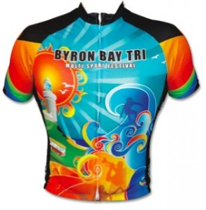
Brad Anderson Creates was commissioned to design the cycling jersey for the 2011 Byron Bay Triathlon and future events. The client was very particular about what they wanted represented in the design, with a major focus on fun and to capture the vibe of the Byron Bay lifestyle and ethos. Specifically, the client wanted something bright and with lots of movement, a jersey that would stand out from the other brands’ cycling jerseys and one that you could see coming from far away. There were a lot of elements they wanted toinclude, such as the iconic Cape Byron Lighthouse, beaches, Kombi vans, surfing, music, flowers and the elements of the triathlon. The jerseys sold out in record time.
WK: I always like a good promotional piece of clothing you can see from space! Wow, there’s a lot of design going on, although I do feel that on the day of the event, it would stand out. The client seemed to be very specific and given the complexity of the many things they wanted to incorporate, I think they did a good job. Its unclear how technically advanced the product was. (I hope it was, so the item would encourage repeated use.) I also don’t see any information on the clothing that would allow recipients to act on in the future. It’s always important, even if an item is only being used on the day, to include contact information (like in this case a website address) incorporated into the design. Like it.
DL: If the client requested a jersey that was as bright as it was dynamic, then Brad Anderson Creates definitely met the brief! Talk about eye-catching… from the iconic lighthouse and vibrant beach feel, to the down to earth activities you expect to encounter, Byron Bay is truly represented in a positive, energetic and engaging way. It makes you want to be there and be part of all the action. No wonder they were sold out in record time. The bar for jersey design has been raised.
DK: A wonderfully vibrant and colourful presentation of a basic product that really gives a local focus to both the town and the event. The artwork lends a very strong Australian feel to the product and my feeling is that this would very much be collectable for both event enthusiasts and attendees alike. It lends itself to reproduction on further promotional items also.
RT: Fantastic! Now that’s how to fill a brief. All too often we see instances of an excellent design that loses much in the translation to the finished item. This is one of those rare occasions where the finished product eclipses the original design – kudos to the dye sublimation decorator who brought this jersey to life. I’ve made a promise about wearing Lycra to my family, but I’d still like one, although I suspect they didn’t come in a double extra stout. “The jerseys sold out in record time,” says it all.
3. NT Keno
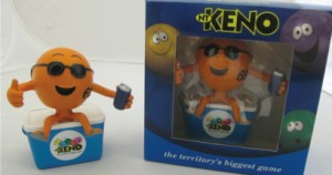 To increase sales of Keno tickets throughout the Northern Territory, the Keno ‘Bobble Head’ was created as a collectable gift, by Branded Products, that could be won through Scratchie cards. The product was different, fun and epitomised the lifestyle of Territorians, who are well-known for relaxation.
WK: This item is a perfect fit for the target market. I can see this bobble head on utes from here to Darwin! Fun design and the packaging showcases the product. I like the bright colours and can see how this would have been a collectable item that would have caused some repeat attempts to obtain it. It looks like it was custom made for the promotion, which provides a higher perceived value. Love it.
DL: This one to me was very simple, but sometimes simple is best. NT Keno’s ‘Bobble Head’ is bright, fun and doesn’t take himself too seriously – a good fit with the NT Scratchie buyers, I’m sure. He will no doubt make a quirky collectable gift – and I guess he will always nod happily, no matter how much you spend on Scratchies.
DK: This has a great retail feel, especially with the packaging, which gives a high perceived value. The concept itself is also good, as it identifies, via the sunglasses and drink, very much with the climate of the Northern Territory, as well as giving the campaign a youthful feel in a market sector that is traditionally a more mature one.
4. Corona
As part of Corona’s winter gift-with-purchase promotion to secure off-premise visibility and increase sales, Zinc Group developed a ‘speaker beanie’ – a warm and innovative beanie with removable built-in earphones for most music devices, including mp3 players and iPhones. Leveraging Corona’s tag line of ‘From where you’d rather be’, Zinc Group drew inspiration from hardcore snowboarders and developed a ‘speaker beanie’ that would have longevity to act as a brand reminder long after the promotion finished.
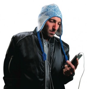
WK: Hmmm… what’s the old expression about selling ice to Eskimos? Cold beer and winter weather… not the easiest sell, but I like the product. Great technology and a nice fashion sense to the beanie. This has the ‘I want that’ factor and it’s a unique product. I don’t see any branding, which I think could have been achieved subtly without taking away from the value of the product or brand. But this product would have hit the target market spot on. Love it.
DL: How do you make a cool beanie cooler? Zinc Group certainly found a way. If they’re into beer and music (and we know they are), I can just see a flurry of snowboarders knocking each other over to get their gloves on a couple of cases of Corona. Why a couple? Because they know they’ll need a back-up Speaker Beanie when one of their mate nicks the first. After all, possession is nine-tenths of the law when it comes to cool stuff. Again, great fit for the target and high on utility.
DK: A nice stand-out that addresses head on (literally and metaphorically) the issue of making desirable in winter a product traditionally associated with summer. The item is both trendy and functional, and has a very high retention value, which is essential for a successful campaign.
RT: I hate being cold and I’m follicly challenged, so I like a good beanie, but I can’t see myself in this one. Then again, it’s safe to assume that I wasn’t in the target audience. I’m wondering if there was any branding, as there is none visible. It’s a good application of a newish technology in the combination of the speakers in the wearable that has previously been seen in hoodies. Anyway I’ve packed my ‘shred sled’ away for summer; bring on the beach! In the absence of any data, it’s impossible to know if or how successful this premium campaign was. Perhaps a nifty lime slicer for summer would be good.
5. Roamz
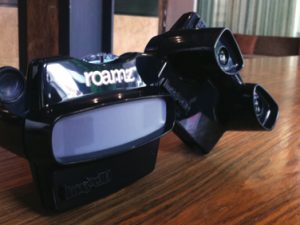 Ahead of Roamz’s official launch of its mobile app for iPhone and iPod Touch at the Web 2.0 Summit in San Francisco in October 2011, it needed to find a way of standing out from its competitors and winning the attention of media and key influencers in the tech space. What started as a fun chat about iconic toys during a brainstorm meeting ended up providing the stand-out selling vehicle Roamz needed. The idea of recreating an old-school View-Master to tell the story of Roamz inspired a sense of nostalgia and fun; it also evoked a sense of discovery. The challenge was to tell the story in seven slides!
WK: It’s a very clever use of a retro product to convey information. But, I’ve seen a number of these in recent times, and I think that although it isn’t particularly innovative, it still would get the recipient to take a look at the information. The graphics on the slides are the real disappointment here; they really needed to pop out, which they didn’t. If you are going to use this medium, the images should be worth the look. All in all, I think they missed the mark on the design which would have affected the success of this promotion. Missed it.
DL: Being Generation X, I’m drawn to all things nostalgic, I can’t help it! Stuff from the 80s just makes me happy. Bad music, bad fashion to look back on and laugh, and say, “What were we all thinking?” Roamz’s use of the beloved old school View-Master as the sell-in tool for its (very Gen Y) location- based technology app – it’s such a fantastically retro analogue way to bring to life such a techy app. The two just go together like… Salt-n- Pepa. In the digital space, where tomorrow’s next big thing becomes yesterday’s news overnight, it’s refreshing to see a brand having so much fun.
DK: Definitely taps into the nostalgia vein, evoking memories of childhood and the growing appreciation of retro toys as collectables. It’s a great non-tech way of providing interaction with the customer and probable group enjoyment: this one is cool, fun and tactile.
RT: I can’t see the link between ‘old school’ and ‘nostalgia’ and a new iPhone/iPad app. There’s one disc with seven images and then what? Landfill? Were there follow-up discs or a reason for the recipient to hold on to the viewer? I don’t think the real potential for this was realised. My gut says this might not have been the success that was hoped for.
6. Harry Potter
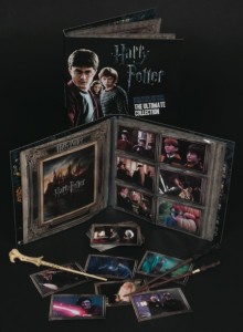 To celebrate the release of Harry Potter and the Deathly Hallows: Part 2, The Promotions Factory (TPF), together with Warner Bros and News Limited, created Harry Potter: The Ultimate Collection, where fans had the chance to relive the adventures of all eight Harry Potter films with movie posters, more than 150 postcards and Harry Potter, Dumbledore and Voldemort’s wands.
WK: I think these are a great set of products that would have tied into the ‘collectability’ factor of the Harry Potter phenomenon. The wand would have been a clear stand out and highly sought-after item. I like the eagerness and excitement this promotion would have created to collect the whole set. Both active and interactive, this promotion hits the mark creatively. Love it.
DL: Collecting really resonates with this target group, and The Promotions Factory has done a solid job of tapping into the ‘dark art’ that involves kids squirrelling away precious clips and life-like props in this fantastic looking book. I would have liked to see the items that didn’t get up. There were no items that pushed the boundaries here, but I know this can be hard when working with such mega-franchises.
DK: This is far from a new concept: it dates back to 1875 when American cigarette company Allen & Ginter issued cards devoted to baseball players, actresses and Native American chiefs. Nonetheless this would obviously appeal to Harry Potter fans and has a good perceived value.
RT: The success of the Harry Potter franchise is undeniable and with all the hype surrounding the final two instalments and the popular following that the brand has built, it’s difficult to imagine that The Ultimate Collection wouldn’t have been a success. I’ve actually seen one of these sets and the owner, an 11-year- old, was particularly pleased. So, on that basis, this was a winner, but was it ground-breaking in some way? Will we see the students from Hogwarts join forces with the Twilight kids at some time in the future to rid us of some previously unimagined evil and provide the vehicle for another merchandising extravaganza?
7. Princess Margaret Hospital Foundation’s ‘Wear a bear day’ campaign
The Foundation required a specialist promotional company to design and produce a charity box to succeed in an exceedingly competitive retail and charitable market. Walkin’ Promotions designed and produced all the products and associated point of sale materials and provided full logistical roll-out capabilities. The range completely reinvigorated and modernised the previous merchandise, thus appealing to a wider audience. The creation of the ‘Wear a Bear-ear’ headbands provided the perfect platform for a full media campaign.
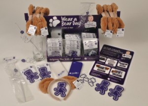 DL: Charity campaigns always pull at the heartstrings, but, because of small budgets and competition from so many other charities, they don’t always get it right. The Princess Margaret Hospital Foundation did well with this campaign though. ‘Wear a Bear Day’ is engaging and, above all, very eye-catching. Think of campaigns such as ‘Movember’ and ‘Red Nose Day’, the success of which is down to their sheer visibility on the street. The promotional material is clear and direct, making it easy to identify in a heavily cluttered marketplace.
DK: Definitely one of the toughest areas in which to create, maintain and increase market share, where compassion fatigue has become an increasing worry for charitable organisations. As the number of charitable organisations grows and the public are being squeezed financially in numerous ways, this campaign has looked to the core values of consistency, message and tight colour coordination, while still retaining humour and longevity. Furthermore, the donor is the adult, but the recipient of the item is a child, thus offering a ‘gifting’ element to the products themselves.
RT: How tough is this market! I can’t imagine anything more stressful than being the decision-maker for a charity putting together a fundraising campaign. You are faced with an upfront cost for an uncertain return in a not-for-profit organisation. So, enlisting the services of a quality promotional product company is certainly a good place to start. This pack looks to deliver everything, including simple instructions for the retail partner’s staff to assemble the point of sale display. It has an excellent assortment of products in stepped price categories to encourage the donor to use up their small change. And it’s topped off with the bears’ ears to give some visibility on the day and allow for some fun promotion beforehand. As with the majority of the programs we have looked at, the proof of the pudding (or should I say porridge?) is in the eating.
8. Meat and Livestock Australia
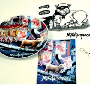 Sands Promotions was given the difficult marketing job of inspiring chefs (and the entire Australian food industry) to consider using the less popular cuts of meat and showcase how to utilise the whole carcass (encouraging less wasteful habits and highlighting opportunities not considered by chefs). Meat and Livestock Australia held master classes and tradeshow cooking classes across the nation to entice chefs and so it needed creative, fun yet visually unique promotional tools to continue the message after the classes had finished. The results yielded animal USB key rings (which contained recipes), striking recipe books, where humour and design held equal value, tea towels, and a limited run of commemorative plates.
WK: Wow. That would have been one difficult brief (one would assume any brief which uses the word ‘carcass’ would be!), but hats off to Sands for combining MasterChef with the current environmental concerns of waste to create a great promotion. One of the best uses of an interesting graphic design to sell an idea I’ve seen for a long time. Fun and clever, the USBs in the shape of cows and lambs containing the recipes are brilliant. The tie into cooking classes and cookbooks highlighting the use of different cuts of meat is very engaging. Best so far. Love it!
DL: I love a campaign that manages to appeal to the three main thought groups – head, heart and stomach! This is a clever, visually impactful and humorous body of work for the Australian food industry. There is a serious message attached, which centres on the reduction of food waste by both chefs and the nation at large. It is a complex issue, but one that they deal with in an informative but easy to digest way.
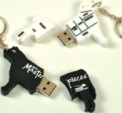 DK: A nice package this one, which echoes the message of ‘less waste’ by the use of the USB recipes, which reduces paper use and the other items that are all able to be used repeatedly – especially when linked to the practical and inspiring nature of the tradeshow ‘master classes’, which also tap into the whole appeal of the chef as a spokesperson and media figure.
RT: A perfect example of a combination of promotional products used creatively to dynamically convey and reinforce a message. Deservedly recognised at the recent APPA (Australian Professional Photography Awards) with two Golds and the Platinum Award. Hats off to the team at Sands for such an excellent demonstration of the benefits of dealing with true promotional product professionals.
9. Arid Zone
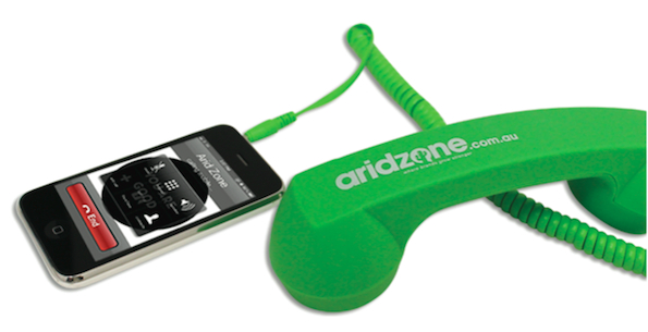
To celebrate the rebranding of brand promotions company Arid Zone, the team produced a groovy retro phone headset to stimulate conversations with clients. The objective of the campaign was to tell existing and prospective clients that the company was ‘the place where ideas come from’.
WK: This is a great retro item. I really like the tie-in with looking after customer health plus calling in for ideas. Customers forget at times that good promotional product companies provide more than the product; they are a resource for ideas on how promotional products can improve their bottom line. I like the tie-in with the celebrity and the AMI. I like the nice bright colour and good graphics. Like it.
DL: If it’s good enough for Lenny Kravitz, then it’s good enough for me! I love it when digital and analogue collide to bring you something that grabs your attention and puts a smile on your dial. It’s fun. It’s silly. It’s something I want just for a laugh… seriously! The retro phone handset certainly works as a promotional item to get clients to call! I’ll be giving the team at Arid Zone a call the next time I want something that will start a conversation and, ultimately, a relationship.
DK: Cool retro feel that integrates the old and the new in a fun way, this has a great novelty value. It is slightly hindered by the telephone cord, which is a nice touch, but would probably become annoyingly impractical – especially when a Bluetooth version is available.
RT: Excellent, ticks all the boxes for a well-structured promotional campaign. High visibility, desirability, large message area (decoration space), a perceived value greater than the actual cost (I suspect), leverages some cool street cred compliments of Lenny. Bound to be a conversation starter, I would be amazed if the results of this campaign didn’t exceed expectations. What you would expect from one of the country’s premier promo agencies running a self- promotion.
10. Dynamix
Dynamix’s motto ‘Your happy is our happy’ sets the challenge that its self-promotions showcase its creative abilities, while making its recipients laugh. Spinning off its desire to build personal relationships between its staff and its clients, Dynamix fashioned a striking teacup (subtly branded with the company logo on the base of the plate) and filled it with very personal teabags. Each teabag was attached to a custom card displaying an image of a Dynamix staff member with outstretched arms.
 WK: A perfect way to put a face with a name. I love the personal nature of this promotion. It creates a great dialogue with the recipient, and the design elements are wonderful. This is playful and engaging. It would also provide the perfect invitation to get together with the clients face to face. It’s great to see a promotional products company effectively using the medium to showcase just how exciting promotional products are when they are applied to perfection. Love it!
DL: Self-promotion is always a tricky one to get right. It’s like entering yourself in a beauty contest, and it always feels a little egotistical. Dynamix, however, has managed to produce an engaging piece that aims to build staff and client relationships by giving a face to the name. I am unsure if getting my nose so close to a dude with a mo’ in my tea is ‘my happy’, but I’m sure this light-hearted gift of personalised teabags in a handcrafted cup will get people talking, and more than likely popping round for a cuppa and a chat about new business. I would love to hear how it was received.
DK: This has a delightfully quirky feel. The cup and saucer appear to be anything but a ‘promo’ item, which ensures longevity, while the personal nature of the way the staff members have been represented creates a pleasant ‘family’ feel.
RT: What’s not to like about this? Creative, fresh, humorous, personal, brilliantly simple, relaxed, timeless. It delivers it all in an elegantly effortless way. As a recipient, it must have been almost impossible not to be engaged and amused by this pack. Congratulations also for the subtle branding on the base of the plate. All too often the perceived need to emblazon a logo on a promotional piece detracts from the overall finish. I have no doubt that those who received this piece will remember where it came from. This has to have been a winner for Dynamix.
11. Hockey Australia
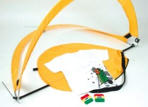 Hockey Australia ran its ‘Hookin2Hockey’ program nationally in an effort to assist hockey clubs with the recruitment of junior hockey players. It approached Arid Zone for hockey related products that would appeal to the target market of five- to 12-year-olds and serve as an added incentive for the children to participate in the program. The company designed brightly branded, foldable, portable hockey goals, T-shirts and sweatbands.
WK: I think this is incredible value for such a substantially-sized product. It is very useful for the target audience, with great results. Easily delivered and shipped with a nice branding exercise. It was a good program uptake – with people wanting to buy the product separate to the campaign. I love the fact that it provided an additional revenue stream for the client they didn’t expect. Love it.
DL: Getting more kids into sport is always a worthwhile pursuit. Hockey Australia’s partnership with Arid Zone was a great fit to produce a range of brightly coloured, portable hockey products that would get more kids running around waving sticks in the air! Great! The gear looks fun and appealing and certainly user friendly, but I wonder if, with so many other sports vying for their attention during the run-up to the Olympics, they could have done a little more to keep the kids hooked? As a single prize, though, it’s very solid.
DK: This package addresses and delivers quite a specific message to a specific demographic and promotes the profile of the sport and healthy living, and provides both passive and interactive options for the recipient. A good buy-in vehicle.
RT: This looks like an attractive pack, well-branded with the program logo. But did it achieve the results the client had hoped for? Not that I’m suggesting it wouldn’t, but rather that I just don’t know. I agree that the T and especially the portable goal would have some appeal to the target audience, but did all participants get a pack? Were participation numbers up on previous years? If the participants take the goal away and don’t have a stick and a ball, does it simply become a goal to kick a ball into?

