Designing for China
Share
![]() Cross-cultural pollination in a globalised world is ushering in an era in which, increasingly, the traditions and ideas of others are becoming universally accepted. Lam Chin Yee, senior designer at Sydney-based creative agency BWD, writes that this has ramifications for professionals who are designing for Chinese clients and audiences.
Cross-cultural pollination in a globalised world is ushering in an era in which, increasingly, the traditions and ideas of others are becoming universally accepted. Lam Chin Yee, senior designer at Sydney-based creative agency BWD, writes that this has ramifications for professionals who are designing for Chinese clients and audiences.
To create cross-cultural graphic design that genuinely delights and engages audiences, it’s important to understand the history of and differentiation between Western and Chinese culture.
Chinese design has developed in tandem with distinct periods in history, with graphic design beginning to evolve in China in 1979 with the opening of the country’s economy.
In traditional Chinese brush painting, Shan Shui, the main purpose of drawing landscapes is not just to represent the exact appearance of nature, but to reflect the painter’s feelings and emotions in relation to the landscape, and his or her life philosophy. (An essential Chinese philosophy is the unity of heaven, Earth and human beings.)
Chinese artists have long exploited the richness of ink brushes in a variety of styles. As a result, the techniques of using brush and ink to produce expressive brush strokes conveying mood, feeling and emotions have become core themes in their work.
Western painting can trace its origins to ancient Greece and Rome, and its development was contemporaneous with other art forms such as music, dance and sculpture. Western painters pay much attention to proportions of light and shade, perspective, anatomy and chroma, as well as originality and individuality.
So whereas a Westerner might talk about a deer in the forest, a Chinese person might talk about a forest that has many things, one of which is a deer. Another way of putting it is that Chinese people tend to think from macro to micro, whereas Western people think from micro to macro. A generalisation, of course, but one with some validity.
When writing an address, the Chinese write, in sequence, the province, city, district, block and gate number. Westerners do the opposite. Chinese put surnames first, and the year before the month and date.
Creating products
While the East has a long tradition of working within boundaries and guidelines, the Western designer has traditionally tended to be more interested in making things unique, individualistic and original, and getting attention.
As Chinese companies begin to design and produce products for their home market and abroad, some clients in the East have therefore been more likely to ask a designer, ‘Has this been done before?’ wanting to know if a product sold well, and often seeking copies of items that have been successful in the past instead of those that have just hit the market.
But things are changing quickly. Massive cultural and economic shifts have been transforming Chinese design from imitation to innovation. More and more companies are moving from ‘Made in China’ to ‘Designed in China’.
Chinese characters
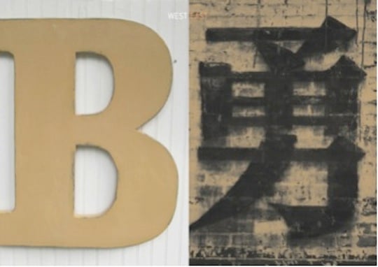
Unlike their Western counterparts, Chinese designers have staggering choice in typefaces, which inevitably affect the way they think about their work. There are over Chinese 50,000 characters. An educated Chinese person knows about 8000, and at a basic level you need to know 2000 to 3000 to be able to read a newspaper.
Understanding cultural symbols
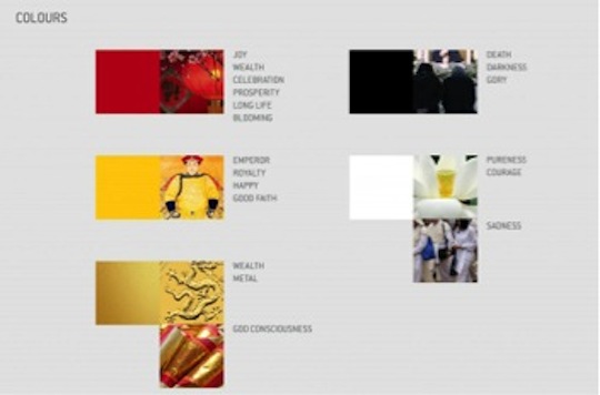
In Chinese culture, colour is often used to shape and define lives, habits, values and feelings, and it can be an important communication tool tied to religious, political, and social influences. Red symbolises good fortune and joy, while yellow, the colour of imperial China, symbolises royalty, happiness and good faith.
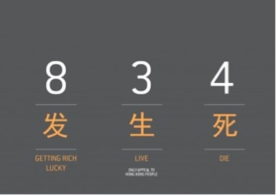
Likewise, certain numbers have specific emphasis and meaning, as the image below shows:
Feng shui, a traditional Chinese system for harmonising people with their environment, has special meaning in design, especially in relation to buildings. These should be oriented in an ‘auspicious’ manner with reference to local features like bodies of water or land forms, balancing opposing forces in nature – the yin and the yang – such as night and day and hot and cold.
A king would be expected to sit on a throne with the bulk of the throne behind him, to give him a ‘proper’ orientation. It’s the same with buildings. They should generally be constructed, for instance, with the rear facing a mountain and the front facing water.
Using characters for cross-cultural audiences
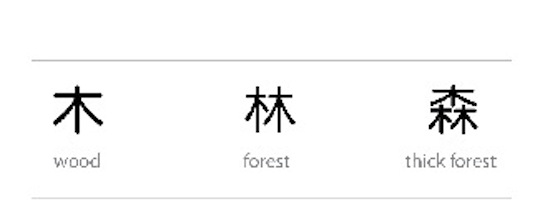
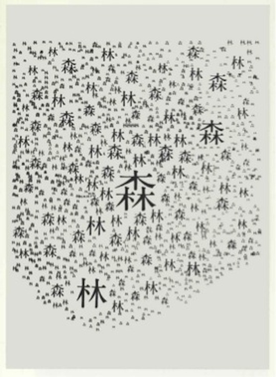
Chinese characters (pictograms) can help create fascinating and meaningful designs for cross-cultural audiences. Here’s how you could depict a forest in an imaginative way:
Chinese characters differ in height and width from Western ones and take up to 30% less space on a page. There are also sharp contrasts in character weight and density, which any design professional must appreciate. And unlike Western characters, all Chinese characters are square, no matter how complex. This, too, must be factored in.

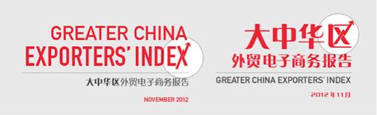
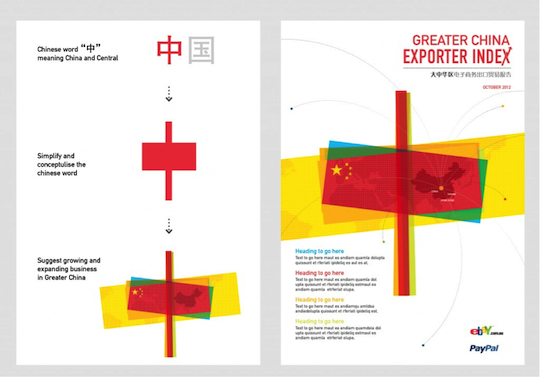
These differences present challenges. Consider the English and Chinese versions of this project for eBay. I had to change the icon in the Chinese version of the cover title, for example, because the English title version didn’t work well on the equivalent Chinese character. I also made other subtle changes in the treatment of numbers.
Creative opportunities
How else can these ideas be used in practice? Here’s a design idea we developed based on Chinese paper cuttings and the shape of an old coin, with the graphic elements simplified to reflect the China content.
Here’s another example, in which we extrapolated the Chinese word for ‘China’ and ‘Central’ into a design for client PayPal:
And here’s how we used pictograms to combine objects and words for another client, Bright Foods:
While on the subject of aligning these ideas with contemporary, compelling designs . . .
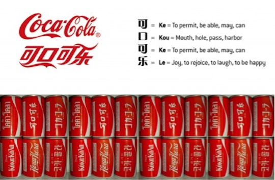
. . . the Chinese Coca-Cola logo is especially interesting. The way you pronounce the Chinese words that appear in the logo is Kekou Kele, which means, ‘delicious, refreshing and joy’.
Business opportunities
Good designers continually seek new opportunities for great and interesting concepts. Fusing cultural images, typography and ideas can provide a brilliant source for such concepts – especially when designing for multinational organisations in an increasingly globalised world.
With Chinese companies seeking to build global brands and multinationals looking to boost sales in the mainland, opportunities just keep expanding for the design business.
The designer can play a key role as a ‘bridge’ to connect East and West and sell products. The challenge is to produce designs that everyone can both accept and understand.
Lam Chin Yee is senior designer at Sydney-based creative agency BWD.