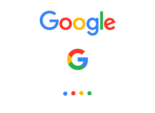
Yes, Google has a new logo – but why?
Share

Per Mollerup ponders why Google needed to make yesterday’s updates to its brand identity, in this cross-posting from The Conversation.
As you’ll no doubt know, given the blanket coverage thus far and the fact you evidently use the internet, Google has given its logo the largest overhaul in 16 years. Instead of being written with a serif typeface, the new logo is written with a custom designed geometric sans-serif typeface. The colours of the letters are blue, red, yellow, and green as before. So what’s the point?
The point is simplification. Google wanted:
A scalable mark that could convey the feeling of the full logotype in constrained spaces.
In small words: a logo that can be produced and seen in smaller sizes than before. This is an essential functional quality since the Google logo today not only appears on computer screens but in several other applications, including wearable devices, with less space available.
Google also states other reasons for the logo change. These, roughly said, deal with reflecting the spirit of the company better as it widens its activities.
For use in very small contexts, Google has developed a four-colour capital ‘G’ to substitute the old lower case ‘g’. It has also introduced four coloured dots, the use of which is not totally clear:
A dynamic distillation of the logotype for interactive, assistive, and transitional moments.
Finally, a new geometric sans-serif typeface has been introduced to go with the new logo: Product Sans.
Google rightly stresses the childlike simplicity and playfulness of the new logo. But is it better than the old logo?
More practical? Yes. More exciting? Hardly. But much depends how it will be used. Google’s news release concerning the new logo does not reveal whether it will continue to adapt its logo to special occasions on special days – such as the Google logo made of LEGO bricks to mark the toy bricks’ 50 year anniversary.
The basic idea of graphic brand identity is reputation by repetition, but sometimes a short-lived change makes us see the well-known in a new light. It is Google’s privilege to be bold in its logo adaptions since – like TV stations – we see them so often in the same place. They are not easily confused with something else.
With its welcoming logo on the white screen homepage with minimal text, Google’s logo has long been a paragon of simplicity. Long forgotten are the cluttered user interfaces of its former competitor search machines.
When large corporations change their logo they typically simplify. Shell, Westinghouse, American Airlines to mention a few. Simple logos are more robust than more complex marks. They are easier to produce and easier to read under difficult circumstances.
When companies adopt their first logo they typically want to say as much as possible. The rationale is that the market will look at their logo, and correspondingly understand the company’s special place in the market. This often leads to rather complex designs.
Procter & Gamble in many years sponsored its 1882 logo showing the man in the moon and 13 stars, a reference to the the original 13 North American colonies.
Later, companies realise that once the logo is learned it is just noticed rather than studied and interpreted. We don’t speculate much about an Apple apple when we see it – we just think Apple. Whatever symbolism was invested in the original multicoloured Apple apple is long forgotten.
When companies realise their logo is too complex in practical use, time is up for a simplification. Some companies change their logo gradually, sometimes because they both want and don’t want to change.
Some companies change gradually as part of a long-sighted plan. 3M has changed its logo more than 30 times in the last hundred years. Most of the changes were simplifications. When 3M (and other companies) reached the bone they stopped changing.
Google has adjusted its logo a number of times – the last time being in 2014 when it moved the ‘g’ and the ‘l’ microscopically.
There are other reasons than the strictly practical to simplify logos. In a world that is already filled with clutter, simplicity is a strong message. It is the designer’s noblest aspiration to explain a complex world in simple ways.
![]()
Per Mollerup is Professor of Communication Design at Swinburne University of Technology
This article was originally published on The Conversation. Read the original article.


