ABC rebrand takes main TV channel back to its roots
Share
The Australian Broadcasting Corporation has undertaken a rebrand on its main ABC TV channel with a return to its roots, including a return to the old logo form and dropping the ‘1′ from its title.
ABC worked with several creative partners to achieve its new look, which also includes a new colour palette, new typography and a conversation-starting tagline, #ourABC.
Here are some of the changes viewers will see on their TV screens:
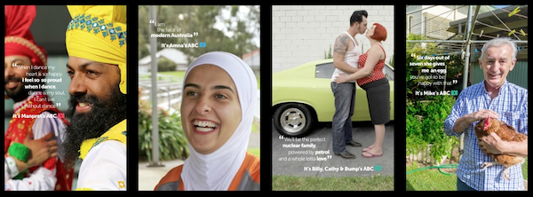
New outdoor advertising promotes the aims of the ABC rebrand – being inclusive, highlighting togetherness and connecting Australians.
A 60-second promotional piece featuring Hunters & Collectors’ ‘Throw Your Arms Around Me’ and 20 new channel idents celebrate diversity and put eclectic characters on stage, front and centre.
The ABC rebrand also includes the launch of ABC Open, an online initiative that helps regional Australians create and publish photos, stories, videos and sound.
Our ABC is another online destination to which people can upload their own interesting anecdotes and images.
The ABC collaborated with several creative partners to achieve the new look.
The project was sent to tender late last year and awarded to Method Studios, who have been important creative partners in the development process.
ABC Television worked with Maud to develop the brand strategy work.
Audio composing house Uncanny Valley won the tender to compose tracks for the new branding elements, with the tight brief to include the iconic ABC three-chord pneumonic in the channel idents.
ABC Television head of marketing and communications Diana Costantini said the ABC team played an instrumental role in creatively driving the project and influencing its outcome alongside its creative partners.
“Strategically and creatively we’ve tried to leave no stone unturned, working hard to be distinctive and modern in some areas while giving a nod to the goodness of the past in others.
“For example, we’ve revisited the 80s logo design so you’ll see the ABC ‘worm’ – or Lissajous curve – in a simplified 2D form with a fresh, new colour palette. In a first, we’ve dropped the ABC typographical lockup. We know that we have one of the most recognisable logos in this country so the ‘worm’ has become the hero and we know it’ll shine on its own.”


