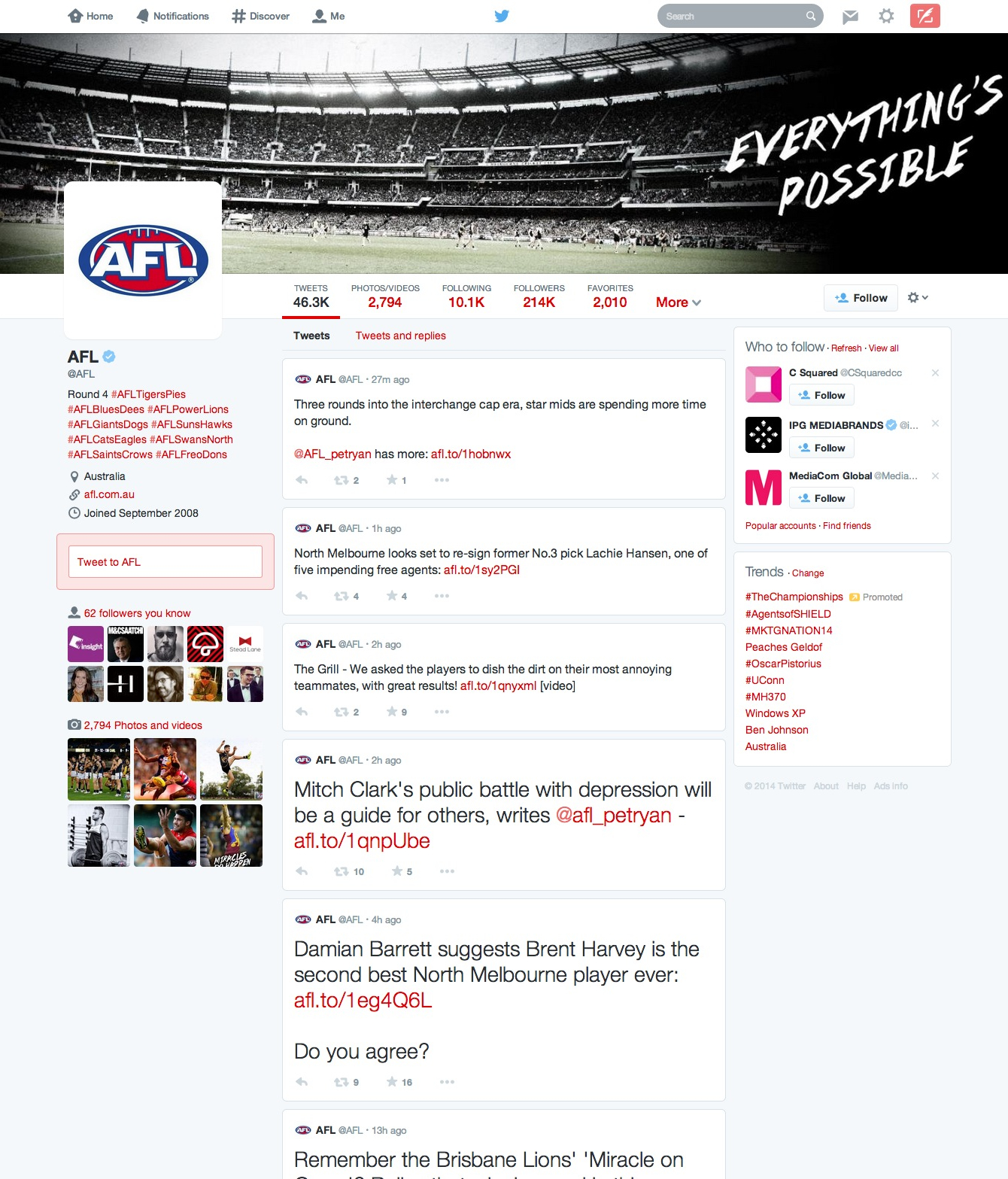
Check out Twitter’s new-look profile pages – seem familiar?
Share
Twitter has unveiled a “new and improved” design of profile pages for brands and users, but some commentators have pointed out the similarities to that of another prominent social network.
The refreshed look, which will roll out to all users over the coming weeks, incorporates several new features, including:
- Best Tweets: Tweets that have received more engagement will appear slightly larger so the best content is easy to find.
- Pinned Tweet: Pin one of your Tweets to the top of your page, so it’s easy for your followers to see what you’re all about.
- Filtered Tweets: Now you can choose which timeline to view when checking out other profiles. Select from these options: Tweets, Tweets with photos/videos, or Tweets and replies.
Local accounts that have switched over to the new profile so far include AFL (pictured) and Hyundai A-League.
The new design has attracted comments over its similarities to the brand page design of competitor social network Facebook. Mashable’s Stan Schroeder says the similarities are inescapable: “There’s a square profile photo in the top left, and a large ‘cover’ photo on top dominates both pages, for example. Below the profile photo you’ll find the basic info about the user, and under that is photos and friends.
“The only real difference there is that on Twitter’s user profiles, photos are placed below your followers, and Facebook has it the other way around. It’ll be interesting to see what the users think of the new look – especially those that are not overly fond of Facebook.”
Compare the below to the AFL’s Facebook page and make your own judgement:


