Google’s new logo is grotesk
Share
Google has launched it’s new visual identity, the first major change to its logo since 1999, and arguably the biggest change to the brand’s look in the company’s 17-year history.
The serifs of the old ‘Google’ logotype are gone, replaced by a more modern sans serif typeface – also called ‘gothic’ or ‘grotesk’ in typography parlance.
The rebrand comes on the back of the announcement last month that a new umbrella company, Alphabet, is being formed to split the many and varied Google endeavours and make it easier for investors to see what’s going on.
The new identity includes the logo, a four-colour ‘G’ symbol and four playful dots.
![]()
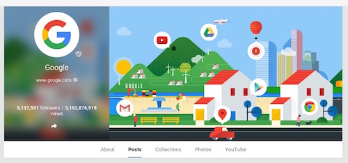
This is what Google’s Google Plus page looks like now:
The change is showcased in today’s Google doodle (of course), as well as this video of the logo’s history: