Chartered Institute of Marketing rebrands with a new identity and ‘hackathon’ to solve marketing’s problems
Share
Internationally-recognised certification body Chartered Institute of Marketing (CIM) has rebranded with a new ‘future-fit vision’ and announced a three-month research program it is calling a ‘hackathon’.
The UK-based CIM, which has been running for 104 years, certifies marketing qualifications in Australia through the Australian College of Marketing.
The organisation undertook a 12-month extensive research and consultation process in order to redesign its brand vision, in consultation with its thousands of members, marketers, senior business leaders and its own staff.
CIM’s new brand role is as ‘the catalyst for collective intelligence’ as an active participant in, rather than simply a voice for, discussions on the marketing industry.
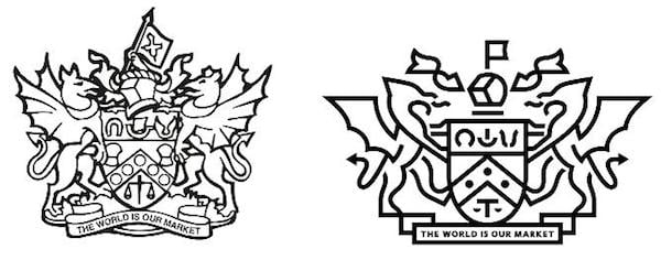
International brand strategy agency Brash Brands redesigned the brand’s visual identity from its red and black design featuring a crown to a minimalist blue wordmark.
Aa part of the new strategic direction for CIM, it has announced the ‘The Marketing 2025 Hackathon’, which it describes as ‘the largest conversation in our history about our future’, to run over January to March 2015.
The project will aim to gather collective insight from marketers and business people globally, exploring key themes, predictions and challenges and aiming to develop and implement solutions to marketing issues.
CIM chief executive Anne Godfrey says the hackathon will bring together the ‘best and brightest’ marketing thinkers to address issues encountered from rapid changes to the industry.
“The last 10 years have seen seismic change in both business and society, the scale and pace of which has had a transformational effect on how we live and work. No other corner of business has felt this more than marketing, and we believe that the next ten years are a ‘make or break’ for the profession.”
Thomas Brown, director of strategy and insights at CIM, explained the story behind the CIM brand design in a blog post, calling it “CIM’s biggest strategic and creative brand change in more than a quarter of a century.”
“A brand’s identity shouldn’t be based on popular opinion, consensus, the whim of a creative director, or the views of a biased marketing director,” he writes. “Rather, brand identity is the creative translation of strategic intent – the visual and verbal manifestation of who we are, our values and our future vision for the brand.
“This was the primary driver in the development of our new identity framework, but we also considered some additional rationale, including feedback from volunteers, customers and other stakeholders.”

“To bring our heritage into the forefront of our brand, we set about re-crafting our crest to tell its story more effectively,” Brown explains. “We took inspiration from brands such as The Royal Mint, The Old Vic, Gieves and Hawkes, The Goring, KLM and Royal Mail to understand how to modernise without losing its integrity.

“Royal blue as the lead colour, reflecting our values of intelligence and authority, our collaborative aspiration and, in particular, our Britishness (key to our heritage and particularly important in international markets).
“Aqua is our disruptive colour; it represents clarity and creativity and – as a more dynamic colour – can balance the strong nature of royal blue.
“Silver is the final primary colour, and is designed to be used discretely and sparingly in a lower proportion to the other two to symbolise quality and trust.”

“We looked at how other organisations approach these [brand positioning] ideas of unity, collaboration, catalysing, and bringing-together and found a common theme: in-line typography,” writes Brown. “We took inspiration from other brands which hold this idea such as CNN, United Biscuits, Royal Mail, Agip and the Glasgow Commonwealth Games. This informed the in-line style of our new wordmark.”


