Fandangling a new ice cream brand: an insight into the creative process
Share
Sarah McGregor, head of copy at Leo Burnett Melbourne, tells how her agency collaborated with Peters to design Fandangles ice cream, embedding the creative into the new product’s brand identity right from the beginning of the process.
 Creating a brand from scratch is a unique and exciting challenge for any creative business. It’s both daunting – the possibilities are literally endless – but also incredibly exciting because you are able to mould and control every element, ensuring they all fit together seamlessly to create the biggest impact.
The brief
![]() Early last year, we were given such a challenge by Peters Ice Cream. They wanted to create a new ice cream brand in a segment where they didn’t really have a presence – ‘family essentials’. This segment has been dominated for years by one major player, but Peters recognised that both retailers and consumers were feeling the options had become a bit limited – and a bit boring.
Early last year, we were given such a challenge by Peters Ice Cream. They wanted to create a new ice cream brand in a segment where they didn’t really have a presence – ‘family essentials’. This segment has been dominated for years by one major player, but Peters recognised that both retailers and consumers were feeling the options had become a bit limited – and a bit boring.
The time was ripe to create a unique and different brand, hitting the sweet spot between everyday and special, that would both reinvigorate the category and be a true challenger. The key to launching this new brand and demonstrating sustained success was to create impact in a category that had remained surprisingly stable over the years and to be seen as meaningfully different amongst the myriad of ice cream and snacking choices.
The brief dug deep into the target audience of Australian families, identifying key insights like the lack of a cultural ‘generational divide’ between parents and kids. Unlike in the past, parents and children now actively consume (and enjoy) the same kind of entertainment – they both use Facebook, attend Katy Perry concerts together and watch Modern Family, as a family. It was important to create a product that appealed to the whole family, so that Mum, the main grocery buyer, could make a choice every member of the family would be happy with.
The naming process
We started the all-important naming process by thinking about cultural examples that spoke to families. We immersed ourselves in modern content like the animated series Adventure Time and films by Pixar and Tim Burton, as well as the books we’d grown up with and are now sharing with our children. The way Roald Dahl used language was particularly appealing – he had a gift for creating nonsense words that somehow sounded exactly right for what he was trying to describe. Think of onomatopoeic examples like Snozzcumber, Lickswishy or Oompa-Loompa. Ambiguous, fantastical but highly memorable and appealing.
Ideas were plentiful, but one seemed to stand out from the rest. We kept coming back to it. It felt instinctual. Everyone who saw it immediately took ownership of it and had an opinion on what it meant. It was a feeling shared by not only ourselves, but by Peters too – and eventually by focus groups of families. And so Fandangles was born.
The visual identity
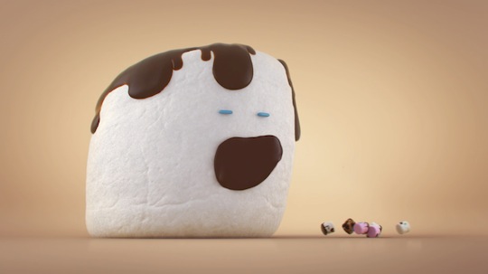
The next step was to create a visual world around the kooky, slightly nostalgic flavours that Peters created. They sought to challenge the dull options of our competitors, by offering variants like Toffee Whoopee Cookie, Caramel Popcorn and Fairy Floss. Working with our design team, we invented characters that would inhabit the world of each flavour – singing marshmallows, whoopee cookie UFOs, 3D glasses-wearing caramel popcorn pieces. These little guys became the basis of our packaging – their ability to leap off the page (or pack) – an asset in a very crowded supermarket freezer. A fun and colourful nod to nostalgia gave the brand a sense of timelessness and quality. Paired with a marque that was designed to mirror the shape of the ice cream itself, each box told the story of the brand, becoming a piece of media in its own right, influencing the buyer right at the point of purchase. Although we knew that our target liked their current ice cream choice, we thought we could entice them with a delicious, fun and imaginative looking product.
The TVCs
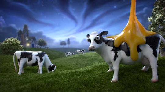
Working with animation studio, Mighty Nice, we then went about creating short, entertaining little commercials, starring our characters, paired with an irresistible jingle that helped get the name into people’s heads. To ‘fandangle’ became a verb, letting us put our own spin on the everyday – fairy floss sticks grew wings and flew like birds, marshmallows sang their squishy hearts out and cows were abducted by little green men flying cookie spacecraft. The continuity with the packaging helped supermarket shoppers easily find our new product.
The digital component
Every pack contains a short blurb about each flavour, which reveals a code that can be entered online to unlock games and content when a Fandangles stick is laid over the words. This digital component was executed by Deepend, providing an interactive aspect to the packaging, unique in the category. A high impact outdoor campaign of path to purchase metrolites, special builds and large format supersites, and a sponsorship with X-Factor, further rounded out the comms, which launched in October.
The wrap
Results exceeded expectations with Fandangles flavours becoming some of the highest performing stock-keeping units (SKUs) in the segment, with the brand now on track to exceed the target business objectives by year’s end.
All in all, taking on an established category with a little bit of clever ‘fandangling’ has paid off handsomely. By working together closely from the brand’s inception, we have proven how successful this approach can be for agencies and clients, helping every touchpoint become more effective than if they had been created in isolation.