Vision Australia’s rebrand: a story of collaboration
Share
Vision Australia has launched its new brand that focuses on its clients.
Vision Australia’s rebrand, developed in collaboration with Designworks, addresses a unique set of challenges.
The new brand aims to demonstrate the organisation’s commitment to putting its clients first.
“I’m tasked with creating a new identity, how do I do that for someone who’s blind and can’t see the identity?” says Vision Australia CMO Megan McAlpine of the project’s unique set of challenges.
Designworks collaborated with Vision Australia to shape the brand strategy and positioning, identity development and architecture, taking about eight months.
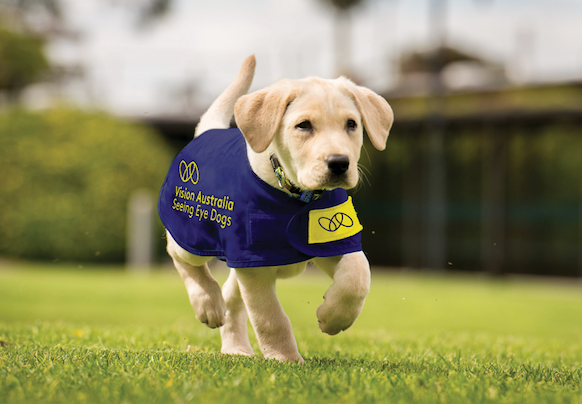
![]()
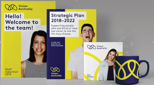
The rebrand employs a link logo to demonstrate how the organisation aims to link clients, staff, volunteers, donors and community in a way that benefits people who are blind or have low vision. It also includes the new tagline ‘Blindness. Low Vision. Opportunity.’
The rebrand was needed in response to a changing marketplace with growing competition, says McAlpine in an interview with Marketing.
“We’ve got a pretty strong fundraising brand. Vision Australia and Seeing Eye Dogs. We’ve never really had to compete for people who are blind or low visioned. We received block funding from the government, and we’d deliver services. People had no choice than to come to us. NDIS and My Age Care, and the concept of giving choice and control back to the consumer has turned the delivery of disability services on its head. We’re in a position now where we’ll have to compete.
“I wouldn’t be surprised if Bupa and MediBank are planning a foray into delivery of, or the coordination of delivery services. We’ve got some pretty significant digital disruptors coming into the marketplace as well,” she says.
The rebrand was developed in a truly collaborative way. “Right the way through, we spoke to clients, we spoke to family members of clients, we spoke to fundraisers, volunteers, we did extensive research,” says James Sterling, creative director at Designworks.
The link logo came from the brand story of Vision Australia, and its focus on helping clients. “From the brand story sprung this idea of Vision Australia playing the role of the link between clients, donors, fundraising and volunteers,” says Sterling.
“The middle link,” says McAlpine, “is our clients. The other two links are how we arrange our donors’ money, our volunteers, our paid workforce and our community partners, and our ability to advocate on behalf of our community around our clients to achieve those better outcomes.”
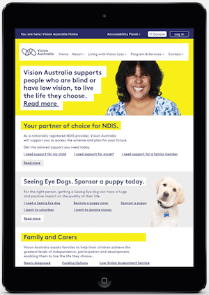 One of the brand material’s key design requirements, is of course the need to cater to vision impaired consumers. “It has to be as visible as possible,” says Sterling. “That means large font. Everything’s in large font, and we’ve used high contrast colours – yellow and blue – and a very, very accessible font. It’s very simple,” he says.
“That normally presents challenges. As soon as you tell a designer to put everything in large print, they start groaning, but I think the designers have risen to the challenge. We want it to look as good for people who are sighted as those that have low vision.”
Measuring the success of the campaign comes down to awareness whether or not the story resonates, says McAlpine.
“We’ve got an organisation that has people who’ve been there for over 40 years. Part of the success is ‘does the story resonate?’ Does the identity resonate with them?
‘It’s been a resounding ‘yes!’ I’ve had people come up to me and say ‘I’ve been here long enough to see three or four different brand changes, and I think you’ve got it right this time.”
Vision Australia is the nation’s largest provider of disability services to people who are blind or low visioned.