Horrible! Plagiarism! Reaction to Tokyo 2020 Games emblem exactly like reaction to every new logo ever
Share
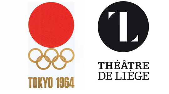
The graphic identity for the Tokyo 2020 has been revealed, and the emblems for the Tokyo 2020 Olympic and Paralympic Games have got anyone interested in brand identity or graphic design talking. The overall reaction is not positive, but more in a confused sense than the hostility that greeted the unveiling of the 2012 London Games logo. There’s also been accusations that the new emblem plagiarises a Belgian theatre’s branding.
Tokyo’s Kenjiro Sano designed the two emblems shown above. Sano is the founder of MR_DESIGN Inc., and is active in the fields of logo mark design, character design, graphic design, package design and advertising art direction, and the Tokyo 2020 Organising Committee made sure to point out that Sano has won a lot of the world’s prestigious design and advertising awards. His works are also featured in the permanent collection at the Museum of Decorative Arts in Paris.
The Organising Committee calls it a work of art. What do you think?
Let us know your thoughts in the comments.
Here’s some of the rationale provided in a media release by the Tokyo 2020 Organising Committee:
When the world comes together for Tokyo 2020, we will experience the joy of uniting as one team. By accepting everyone in the world as equals, we will learn the full meaning of coming together as one.
The Tokyo 2020 emblems were created to symbolise the power of this unity.
The black colour of the central column represents diversity, the combination of all colours. The shape of the circle represents an inclusive world in which everyone accepts each other. The red of the circle represents the power of every beating heart.
These elements combine to create the emblems of both the Olympic and Paralympic Games.
The Tokyo 2020 Olympic emblem is inspired by the T in Tokyo, Tomorrow, Team.
The Tokyo 2020 Paralympic emblem is inspired by = the universal sign of equality.
This is where the confusion kicks in. Without the rationale, people see meaning and symbols that might not be intended. For example, is there a runner (The red circle is the head, the black bar is the torso and the silver and gold corners are the arms.) or is pareidolia running amok?
And things get more awkward when the rationale contradicts people’s own interpretation. For example, the red circle isn’t the rising sun but instead represents beating hearts?
A Wired headline screams ‘Tokyo’s Olympics logo is a confusing, geometric mess’.
It’s certainly not as simple as the last time Tokyo hosted the Olympics. Although, there’s a nice stylistic synergy with the two emblems with the red circle and the gold.
But, as regularly happens with new logo launches, similarities are found with at least one of the world’s other logos, and then the P-word comes up: plagiarism. The current logo for Belgian theatre, Théâtre de Liège, was designed only a couple of years ago, apparently. Several central elements of the Tokyo 2020 emblem share shape and arrangement with the Théâtre’s. Even the typeface?
But really, it’s impossible to know if Sano has ever seen the Théâtre’s logo, and it’s quite plausible, and common, for a design to arrive at a similar result as an existing one, especially if trying to create the same letter.
We’re predicting the Tokyo 2020 Organising Committee will say nothing further on the matter and that after this week the Tokyo 2020 emblem won’t be seen or talked about again until… well, 2020. Or maybe 2019.
Elsewhere, many (non-graphic designer) people are saying they prefer the emblem used in the bidding process, shown below. Bid emblems are typically done on the cheap, and the hibiscus ring with its primary colour palette is nowhere near as sophisticated as the official Games emblem. Although, your author quite likes the sans serif type with the red circle.
![]()
What do you think, readers? (About the logo, about the accusations of plagiarism, or about the video.)