Case study: a shareable welcome – making finances Instagrammable
Share
With the Australian banking sector in absolute turmoil, a faction of new-age banks, or ‘neo-banks’, have begun sprouting. For Up Bank, a totally digital neo-bank with no physical presence, every interaction is precious; here’s how Up won over customers from day dot.
Campaign: Up Welcome Pack
Client: Up
Agency: Ferocia in collaboration with CIP Studio
Background
Australia’s first fully digital bank, Up, was launched in October 2018. This wasn’t when Up first launched though. Creating a digital bank involves making sure a lot of things are rock solid before they’re given to customers, so the Ferocia team had actually been piloting Up internally for a full 13 months before it was launched publicly. Building Up, Ferocia’s developers and technologists were confident they could nail the technology, UX and banking aspects of Up.
The team also knew it needed to take risks to differentiate Up and to resonate with the younger audiences the message that Up has been created to serve. The identity needed to be bold, represent the energy of the team and demonstrate the new technology-led approach at play with Up. As Australia’s first digital banks, the story of Up is full of what could be considered risky ‘firsts’ – the fully digital signup flow (which takes two minutes and 11 seconds on average), in-app support, conversational payments and innovative referral mechanics – however one of the largest bets placed by the team was heavily investing in the first IRL experience new Up customers have: receiving their physical Welcome Pack.
Objective
Launching Up has required a focus on both creating an excellent product that users love – Up aims to help users spend wisely and save effortlessly – but also on finding innovative ways to encourage rapid growth and develop brand recognition. One of the ways Up has innovated has been to invest heavily in the initial welcome pack experience.
Traditionally seen as a ‘cost centre’ by banks, delivering physical cards to customers is something banks have had to do. There’s been very little innovation in this space for decades. A DL envelope arrives on your door with a folded A4 sheet of paper and a stock-standard card glued to it.
For a branchless digital bank, Up was very aware that tangible moments with customers are few and far between. It knew it had to think outside the square, but inside a budget, to delight its new Upsiders. Up suspected that by investing heavily in this experience and making it delightful, it’d be possible to encourage new customers to share photos of their credit cards which would, in turn, encourage their friends to join. Needless to say, sharing photos of one’s card online is not something banks usually encourage one to do via social media and significant innovation was required to get to this point. The team got to work with the objective of making the act of receiving a new Up Card as delightful (and therefore shareable) as possible for new customers.
Strategy
Not content with DL mailers and tri-folded A4 pages, to turn the act of receiving a debit card into an Insta-worthy ‘Welcome Pack’ event, the team had to solve two key problems:
- First, the card had to look fresh and exciting and convey the excitement and vitality of the Up brand, and
- secondly, the card couldn’t have any sensitive information on the front of it.
The team also had to innovate on the way the card was then delivered.
Execution
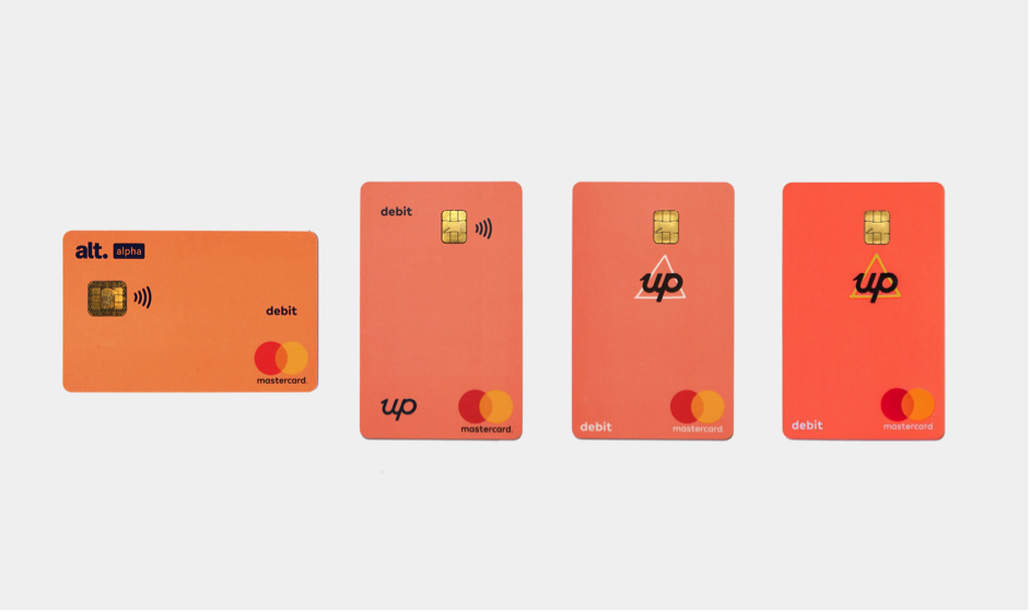
To make the card shareable, a long process of multi-party collaboration and iteration was undertaken. Working with card manufacturers, Mastercard and designers, the card was reformed to move sensitive details to the back, making it the first debit card of its kind. With the numbers moved to the rear of the card, raised numbers removed (a relic from old click-clack carbon copy machines) artwork on both sides could now be oriented in portrait instead of landscape, reflecting the fact cards are now more frequently tapped or inserted than swiped.
Next the team needed to bring the signature style of the Up brand into the welcome pack. From the outset it was clear to the team that a tri-folded A4 sheet with a strip of glue wouldn’t cut it, so dozens of iterations were made to create an elegantly crafted card-cradling mailer where the card could be slid in, instead of ripped off. Removing the card effortlessly was important as it meant that the card carrier wasn’t damaged when the customer pulled out their card. This made it possible for them to recreate the initial delivery experience when taking images for sharing.
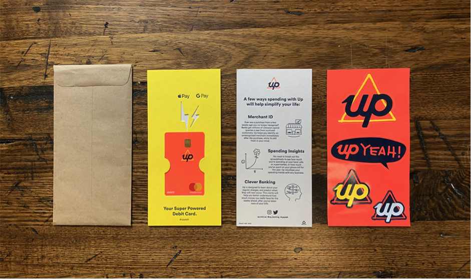
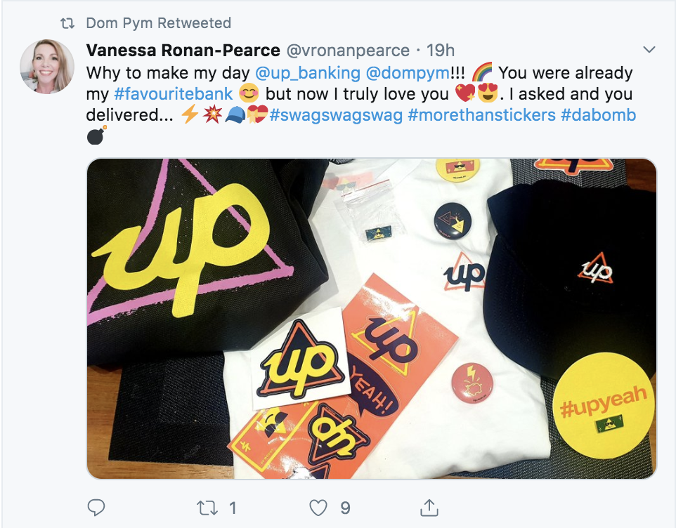
Fluoro yellow and orange inks and beautiful letterpress artwork arriving in a 100% recycled, Australian-made envelope make this a tactile and delightful moment for Up customers which they want to share and show off to their friends. To aid in shareability each welcome pack now also includes a sheet of shareable stickers which many Upsiders stick on their laptops or other great places.
Results
Since launch, the Up Welcome Pack has been shared hundreds, if not thousands of times across all social media channels, well justifying the slightly increased cost of producing the mailer itself and turning what is traditionally perceived as a cost centre into a marketing channel and asset.
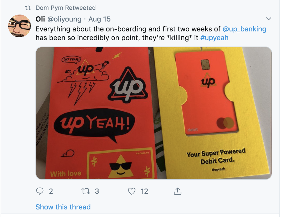
To date, Up has sent more than 125,000 welcome packs all printed on recycled paper. The welcome packs are so loved by our customers that often, if they aren’t put in the recycle bin, they are still in customers homes, on their coffee tables and kitchen benches. The blog post created to explain the process of creating the welcome pack has been viewed more 16,700 times.
Further Reading: