Frantelle gets a new fun personality to fight back against private labels
Share
Frantelle bottled water has rebranded to position itself away from the “sea of blue and blandness” of the category and connect with consumers emotionally and combat a loss of market share to private label brands.
Moving away from its simple blue and purple labels, the Schweppes brand’s new bright and energetic packaging aims to communicate a “fun personality” and stand out.
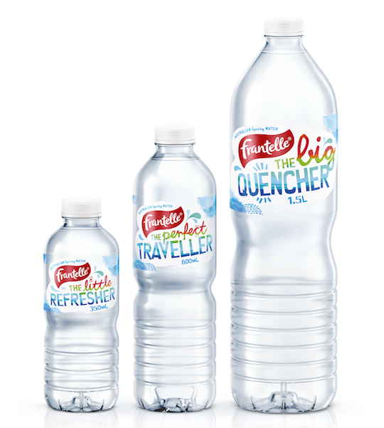
Aiming to connect with consumers on an emotional level and “tap into the great Aussie outdoor lifestyle”, the new bottled water packaging features different taglines on the various size bottles, such as:
- 350ml: “The little refresher”,
- 600ml: “The perfect traveller”, and
- 1.5L: “The big quencher.
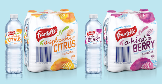
In an extension of the Frantelle brand, Schweppes has also launched a range of flavoured bottled water products, with “a hint of berry” and “a splash of citrus”.
Despite the fact that the total still bottled water market has grown 15% in the past year, Frantelle has been was losing share due to increasing pressure from private label and budget brands. Murray Raeburn, group category manager – non carbonated at Schweppes, explains the branding issue:
“While water is the healthiest beverage choice for many people, it can also be seen as boring. People often comment that water is water is water. This is particularly evident in the water aisle of the supermarket where we noticed there was a sea of blue and blandness.
“People were buying Frantelle for the quality of our pristine Australian Spring water but we weren’t standing out and connecting with people emotionally.”
With rational benefits particularly difficult to differentiate in bottled water, Design agency Asprey Creative created the distinctive personality and tone of voice to get consumers engaged emotionally with Frantelle.
“Our solution breaks new ground in the water category by building a bold, motivational and fun call to action on each pack format that’s specific to its primary usage occasion,” the agency says.
“We built a brand story around gently and light-heartedly encouraging people to think about the need to keep hydrated and the occasions when water would be handy.”
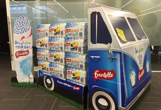
Raeburn says going forward consumers can expect seasonal pack designs and “awesome in-store activation” such as this combi van display.

