

Rio’s Olympic logo: a sculptural logo for a sculptural city
August 16, 2012
Share
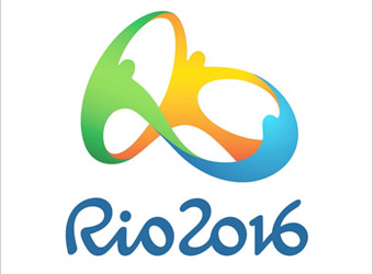
After the derision targeted at London’s 2012 Olympics logo, the logo for the Rio Olympics has taken a significant departure in style to that of its predecessor.
The agency behind its design, Brazil’s Tatíl Design, has released a video telling the (sub-titled) story of its creation – how it’s “a scupltural logo for a scupltural city” and how the three dancing figures represent the city of Rio and the Olympic movement.
According to AdWeek, the logo was actually unveiled on New Year’s Eve at the end of 2010, and withstood a brief controversy about whether it plagiarised the Telluride Foundation’s logo.
It’s been described as “pure flowing joy” and as “embraced globally to much the same degree that the London mark was derided”.


