Branding a nation – reflections on Australia’s new logo
Share
The dust has settled on Australia’s new logo and the reviews by the public and marketers alike have been scathing. From comparing the new golden wattle design to a graphical representation of the COVID-19 virus to criticism on social media about the price tag and timing of the rebrand.
The logo forms part of a larger project underway to rebrand Australia and promote our nation overseas. The costly initiative kicked-off under the Turnbull government as an attempt to create a unified and recognisable national brand, solidifying Australia’s reputation as a trusted exporter of goods overseas.
The project has been led by Australia’s Nation Brand Advisory Council, a group formed of what the government has labelled “some of Australia’s brightest business minds” from the private and public sectors. Creative strategy guidance for the project of re-working brand Australia (beyond just the logo) has come from a Brand Expert Working Group made up of what the government deems “Australia’s best marketing brains”.
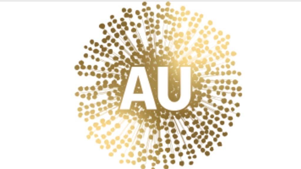
The golden wattle emblem itself (created by Clemenger BBDO and reported to have cost taxpayers $10 million dollars) is made up of a symbolic gold representation of a wattle with the letters ‘AU’ in the centre. After some misunderstanding online that the logo will be replacing the iconic Australian Made product logo –inflamed by Tweets from politicians Mark Coure MP and Cr. Kevin Baker– Australia Made were quick to clarify with a release. According to Glenn Cooper, the Australian Made Campaign Chairman: “The iconic green-and-gold kangaroo logo has been clearly identifying Australian goods in export markets for more than 34 years with great success. It is by far Australia’s most recognised and trusted country-of-origin symbol and is central to the export strategies of Aussie exporters taking their goods abroad. There is no need to make a change in this space.”
Associate Professor Karl Treacher, the CEO of The Brand Institute of Australia, has expertise in corporate brand reputation governance. He shared his thoughts on the unfortunate timing and design of the logo with Marketing:
“The new Australia Unlimited logo presents many issues as a replacement to the existing logo. The first and most obvious is the confusion between what is meant to look like wattle and the coronavirus molecule. Given the state of the world currently, this is a huge issue for the proposed logo and as a result, it should be scrapped and another solution developed. Further, the existing Australia Unlimited logo and it’s iconic boomerang assets was looking a touch dated, however a refresh would have been my recommendation rather than a wholesale rebrand. I’m also concerned about governance here – my understanding is that this logo was designed and developed by Clemms – who have produced some great comms over the years but are in no way brand identity specialists. I would have expected a logo of this calibre to have been developed by Hulsbosch, Frost, Principals, Landor, Futurebrand or The Brand Institute of Australia given the reliance on evidence, research and testing.
The public outcry is a little misguided given the media reported this as the replacement for The Australian Made logo, however it does seem that not enough time and resource was directed to market sentiment and this is exactly what happens when that step is missed or undervalued.”
A report created by the Australia’s Nation Brand Advisory Council in 2019 explains that the unpopular wattle design was chosen because of its “strong history with indigenous and non-indigenous Australians” and as a symbol of unity. The marketing tactics used in the report have not translated to the launch of the logo to the Australian public.
As marketers we understand the importance of creating a unified brand to manage perception, demonstrate values and build reputation. Simultaneously many marketers can relate to the challenges of creating a logo and brand identity that pleases everyone, however perhaps more than anything we understand that rebrand should be supported by a compelling story that sells the makeover to the people who engage with your brand. In the case of rebranding Australia, don’t forget your most important audience – the taxpayers.
Photo by Annie Spratt on Unsplash.