Intricacies of responsive design: the scalable logo study
Share
This post was originally published by Marketing‘s sister publication Desktopmag.com.au.
Responsive iconography – it’s something you already know about and see everyday, but its system and function is not yet widely discussed. We all know about responsive design, and the role of icons, but how does a logo, or brand ‘icon’, work within a responsive site?
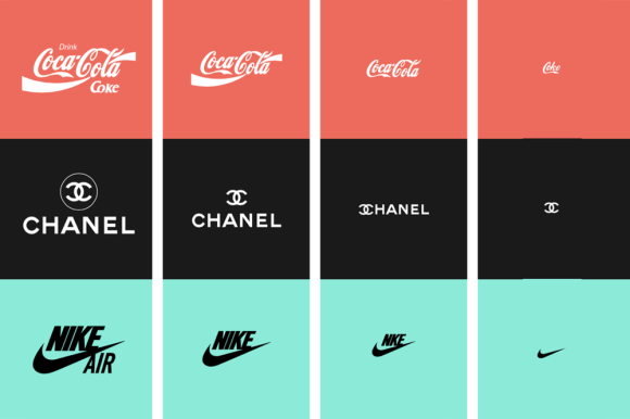
Joe Harrison, a digital designer in the UK, has gone some way to show how responsive design needs to take a logo beyond the usual versions of ‘stacked’, ‘greyscale’ and ‘monogram’, and into something with five or six levels structured levels of scalability to respond to the many devices used across the globe. His interactive study relies on visuals only, to display how successfully a brand can be retained as it is scaled.
“The concept interrogates the varying complexity of symbols used on devices,” explains Harrison, “and aims to find the perfect balance of simplicity in relation to screen size.”


Animated GIF of Harrison’s Responsive Icons study. To see the responsive logos in action, check out responsivelogos.co.uk.
This goes beyond the approach of designing minimal or simple shapes and marks for logos, and instead of using reduction to copy with scale (as in, size), we watch the Disney logo loose a castle, then lose ‘Walt’, then eventually, the ‘-isney’, leaving the distinctive ‘D’.

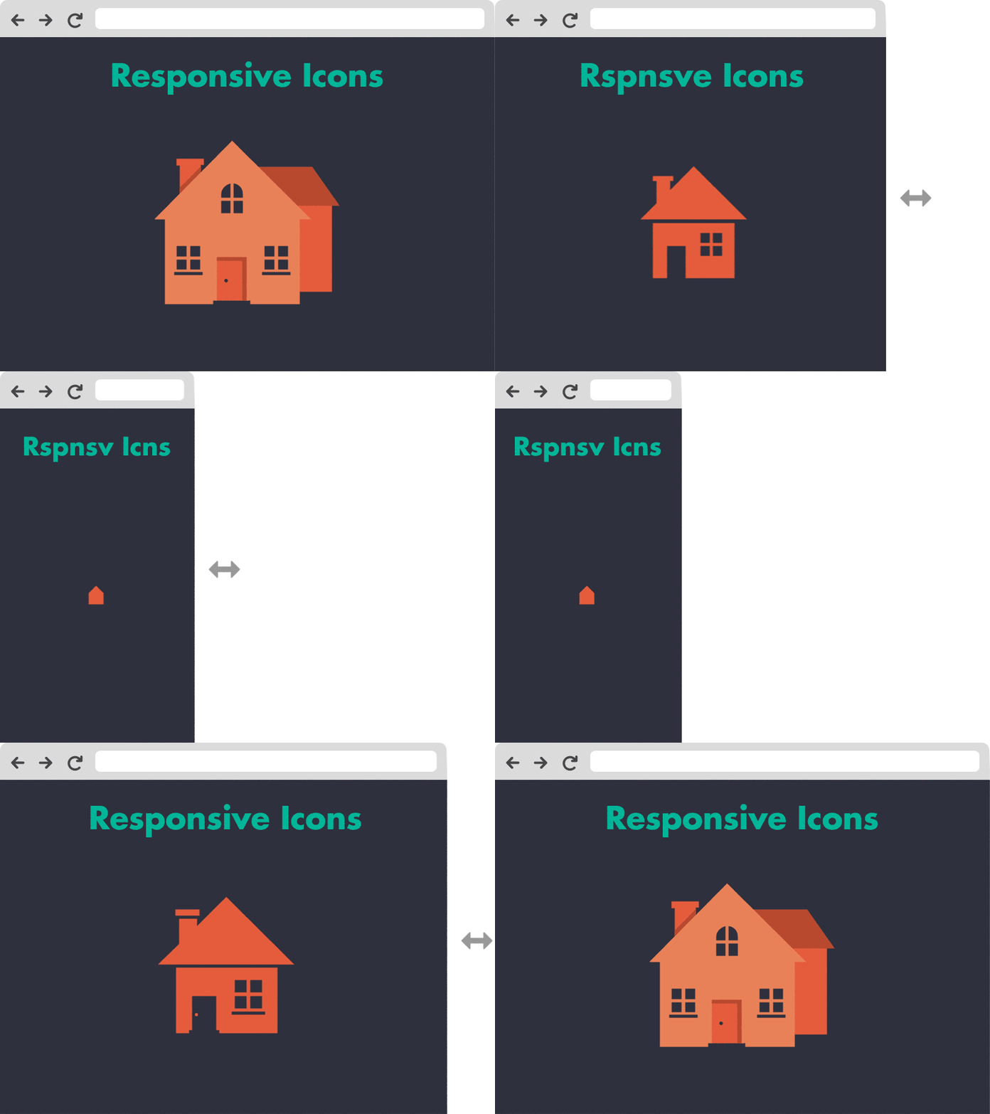
What this specific responsive design approach means is that icons change according to screen size, so individual screen size does not matter. This allows full branding reinforcement (without poor renders, or a too-simple logo at a large size) for everyone.
Flat icons are already widely implemented to appear sharper (and less prone to technological or hardware changes) across devices, but responsive logos means improved experience and usability for users – so overall, the web is better.
In a way, this level of responsiveness has always been done, although mainly for global companies who required their logomarks to be recognisable in vastly disparate contexts and situations. What ‘responsive logos’ means to responsive design is that it is now something worthwhile to be considered by graphic and digital designers for clients of much smaller companies, for their much smaller audiences.


