New Airbnb logo: a symbol of belonging or the butt of jokes?
Share
Global accommodation platform Airbnb has rebranded with a new logo designed as a universal symbol of belonging. But social media users have labelled the new Airbnb logo obscene and pointed out its suspicious similarity to another company’s logo.
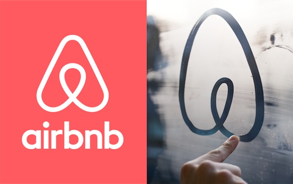
The new Airbnb logo, a symbol called the ‘Belo’, will replace a cursive lower-case blue ‘a’. The rebrand also includes a new website and mobile apps with the upgraded look and feel.
Co-founder Brian Chesky explained in a blog post that the company had “outgrown the original Airbnb brand” since starting in 2008 as two housemates offering airbeds and breakfast to guests in exchange for rent money.
Airbnb now connects hosts in 190 countries offering unique experiences and forging friendships with travellers and renters.
“What started as a way for a few friends to pay the rent has now transformed into something bigger and more meaningful than we ever imagined. Belonging is the idea that defines Airbnb, but the way we’ve represented Airbnb to the world until now hasn’t fully captured this,” Chesky wrote.
The new ‘Belo’ symbol has been designed as an iconic mark for hosts to use on their windows and doors, that can be drawn by anyone and recognised anywhere.
This video also introduces the new Airbnb logo:
Create Airbnb
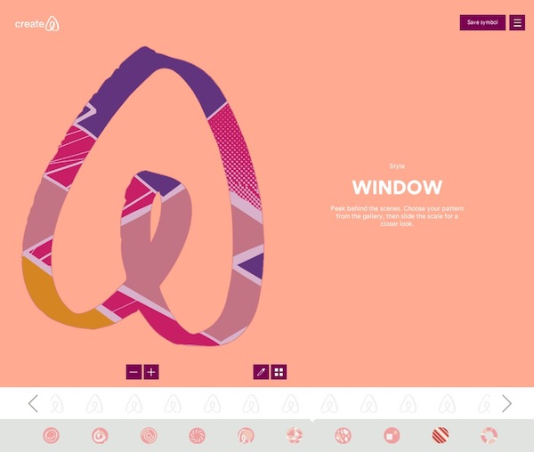
In keeping with the company’s values of shared community, the rebrand comes with a co-creation project titled ‘Create Airbnb’.
Airbnb is inviting members of its community to create their own versions of the Belo symbol to put on their profile pages: “behind each symbol is a story only you can tell – about your home, your guests, and your adventures”.
Users can create their chosen symbol from a range of options through an online program within the new site.
Online criticisms
Social media users have been voicing criticisms of the new logo, likening it to a vagina, a butt and a scrotum, among other images.
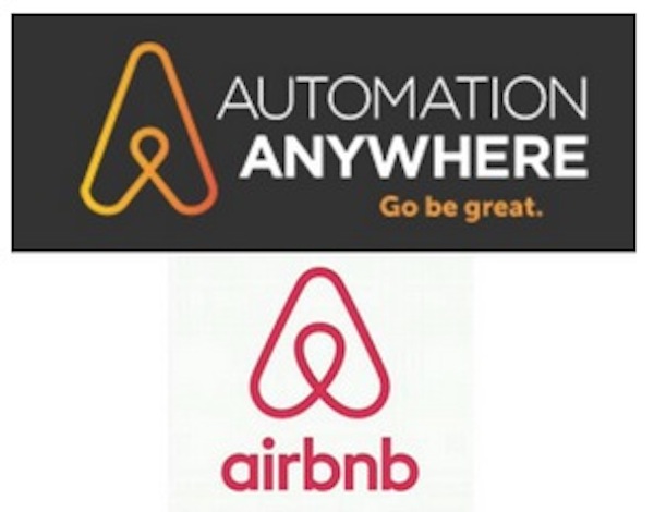
The logo has also been revealed to share close similarities with that of US-based IT company, Automation Anywhere.
Blogs ValleyWag and VentureBeat published this joint statement from Airbnb and Automation Anywhere denying accusations of plagiarism:
“In early 2014 both Airbnb and Automation Anywhere began use of new logos that, by coincidence, have similar designs. Airbnb and Automation Anywhere are working cooperatively to address this issue, and Automation Anywhere is in the process of transitioning to a new logo design that is not similar to the Airbnb logo.”
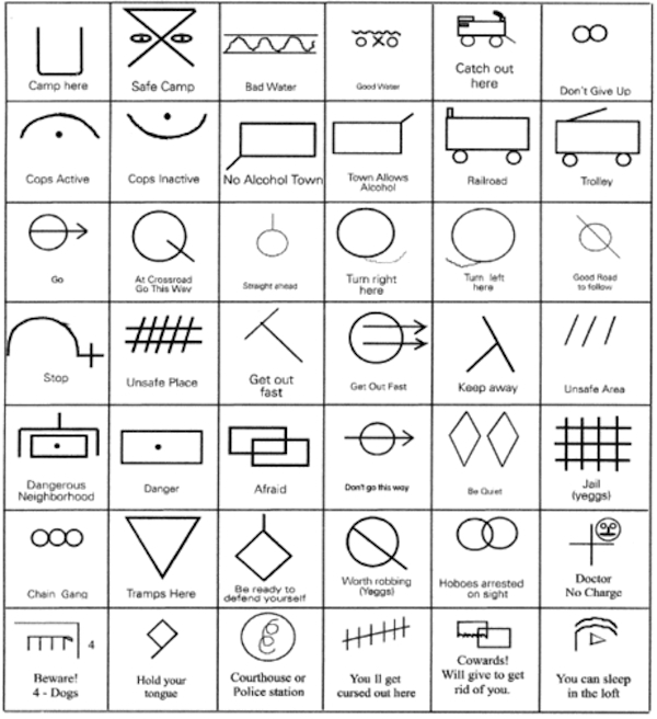
The symbol and its use as a sign of belonging and accommodation are reminiscent of hobo symbols, traditionally used to signal advice to other travellers such as ‘unsafe place’ and ‘camp here’.


