Positively twisted: the inside story of the 10 rebrand
Share
In October of last year, free-to-air network 10 unveiled an all-new look in collaboration with branding agency Principals. The agency and the network reveal what went into the sweeping rebrand. By Brooke Hemphill.
This article originally appeared in The Truth Issue, our October/November 2018 print edition of Marketing magazine.
 In late 2017, CBS, the most-watched free-to-air network in the US, acquired Network Ten signalling the start of a new, stable era for the network. With this new owner and a new lease on life, 10 was ready to change things up. The most visible change would be a whole-of-company rebrand, the first in 27 years. For a task of this nature, 10 needed help and branding design agency Principals was called on to assist with the process.
Wayde Bull, founder and planning director at Principals says, “The opening conversation was around the pace of change. How do you run a proper process to define the way forward, but get to it reasonably swiftly?”
While a rebrand was important to signpost this fresh new era, it was also important that the heritage of the brand remained. The view was that 10 needed to rediscover what had made the brand great throughout its more than 50-year history. “The whole branding exercise was one of going back and finding out what made 10 successful in the past,” explains Bull.
Network 10’s chief content officer Beverley McGarvey says, “A lot had changed at 10 in the past year and we, as well as our viewers and advertisers, were all ready for a fresh approach. Twenty-seven years is a long time for one brand.”
In order to do this, 10 also needed to find its courage once more. It didn’t want to be a ‘me too’ brand. McGarvey says, “Our content is unique and we target a younger audience than our competitors. To stand out, we knew we had to be different.”
Connecting with heritage
The project began with extensive research in conjunction with Principals and the 10 insights team that included viewer research, external industry interviews and a series of workshops with 10 management. The research led to the realisation that 10 had always done well when it offered a genuine alternative to the other broadcasters. “The network had this tradition of being fun, irreverent and proudly different,” says Bull. “In recent years, it lost that courage to be different. Things got too difficult and perhaps there wasn’t the permission to be as brave as they once were.”
Some of 10’s greatest hits over the years have broken new ground such as Number 96, The Box, Puberty Blues, Prisoner, E Street and The Secret Life of Us.
“We found a lot of success as the network for 16- to 39-year-olds a few years ago with programming perfectly targeted to this demographic,” says McGarvey. “We needed to define what set us apart again. Our audiences were the same, but they had grown up. They didn’t take themselves too seriously and they still wanted to be entertained.”
Using this insight, Principals and 10 articulated a vision for the network: to be Australia’s leader in escapist entertainment. Through qualitative viewer research, a positioning for 10 emerged as an escape from the politically correct world to a feel-good place that allowed viewers to break free of the grinding responsibilities of life. The same research helped define the target audience for 10. Compared to its competitors, 10 remains relevant to a broader range of advertisers due to its youthfulness. It became clear that 10 needed to own being the under 50s network.
“What 10 needed to do was come up with a way of saying ‘Maybe we’re not as young as we used to be, but we’re still young at heart’,” says Bull.
Qualitative research also explored the idea of archetypes and the archetype identified that best fit 10 was that of the jester. “It’s this playful, fun and cheeky kind of character. There was a need to recapture that in the identity,” Bull says.
The work ultimately led 10 and Principals to establish the brand idea of ‘positively twisted’. The word ‘positively’ speaks to the tone of programming for which 10 is best known and ‘twisted’ references the network’s history of twisting genres to create new spins on traditional formats. The Project is a perfect example with its tagline, ‘news delivered differently’.
McGarvey says, “We’re the adventurous alternative. We take risks and try new things and we do it with a sense of fun.”
Developing a master brand
A key dimension of the rebrand was the notion that the family of brands within the 10 group looked disconnected. In addition to the main channel, 10 offered viewers two multi-channels – One and Eleven – as well as catch-up streaming service Tenplay. Despite the catch-up service being branded Ten, it also contained content from One and Eleven, making for a confusing viewing experience. “The opportunity through the rebrand was to join up the family much more clearly,” says Bull.
The concept of a master brand required a mindset change in terms of getting the business to think about the sum of the parts.
“We wanted consistency across all our brands and to strengthen the deep engagement we had with our audiences by confirming our entertainment credentials across the 10 family,” recalls McGarvey.
Once the master brand was established, other extensions of the brand were easily integrated such as the online content offering 10 daily and 10 All Access, which launched in December.
A new approach for the multi-channels
To fit with this master brand strategy, One and Eleven needed a rebrand. Principals called on its language arm XXVI to assist 10 with the naming process that followed. Hamish Cargill, director of Brand Language for XXVI, says, “That was quite an involved project as we looked to narrow down what 10 was after and how they wanted these channels to come to life.”
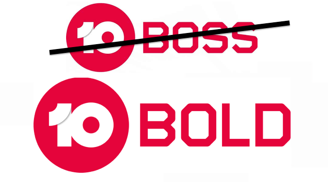
Following multiple rounds of name suggestions, 10 Boss and 10 Peach were selected to replace One and Eleven respectively.
“It was really about capturing the vibe or attitude of both of those channels, not so much focusing on the audience, but more on what’s on there. What’s the programming? What’s the experience of actually sitting down and watching or engaging with those channels?” adds Cargill.
The thinking behind 10 Boss was that programming on the channel is driven by bold, self-confident characters, while 10 Peach offers feel-good escapist entertainment. In later months, 10 Boss would go on to become 10 Bold with the name change still communicating the programming attitude of the channel.
McGarvey adds, “With the new names, we wanted to give the channels meaning that reflects their target demographics. 10 Peach is targeted at 16- to 39-year-olds and the term ‘Peach’ is a feeling. 10 Bold is targeted at over 40s and the term ‘Bold’ is more of an attitude. The shows on the channels reflect this too.
Related: Network Ten ends legal battle with Nine/Fairfax with sassy statement »
The rollout
The rebrand project began in April and culminated with the reveal of the new identities at 10’s upfront event on 31 October. All branding changed over across 10’s platforms within hours of the announcement. As Bull notes, “The ambition to rebrand three channels and a catch-up platform on one day is gutsy. It demonstrated the renewed confidence at the network.”
In many ways, the new look for 10 successfully maintains the heritage of the brand. The 10 master brand retained two out of three elements from the existing mark – the colour blue and the circle – while the 10 switched from the written word to the numerical form.
Perhaps the most significant changes beyond the identity itself are 10 Bold and 10 Peach, which were given their own distinct personalities while still being very much part of the 10 family. XXVI also worked with 10 to develop a unique tone of voice for each of the multi-channels based on the archetype of the jester. “We needed to create some shape that went beyond the superficial idea of the brand being clown-like. We came up with a voice that spans the range from being fun to being quite direct, quite straight up,” says Cargill.
The new tone of voice would then extend into all of 10’s collateral, from on-air promotions to external communications such as media releases and marketing materials. McGarvey says, “We had a new brand, but it was important for us that the new brand lived across all our platforms to really bring it to life. The new tone of voice liberates us and allows us to be more positively twisted.”

The brand idea, positively twisted, is central to the tone of voice with Cargill explaining, “It’s almost become the first and the last question you ask: ‘Is what we’re developing here positively twisted?’ It’s not about being the funniest brand out there; it’s about really connecting with the audience and using the entertainment basis of the business to deliver that. Sometimes that means going really far out there and cheeky but, at times, we’re going to have to be quite straight in our delivery.”
Measuring the success
The hopes for the rebrand are threefold. First, the goal is a sense of renewed confidence and pride in the business, and Bull says the network is already seeing strong signals of this. “It fulfils its primary purpose of giving the business something to rally around,” he says.
McGarvey agrees, adding, “It’s been great seeing everyone across the company get on board. When we first explained it to people, they understood it straightaway and really embraced where we wanted to go with it.”
On the viewer side, the intention is for a significant qualitative impact as this newfound confidence is conveyed to viewers. Practically, the work to bring the multi-channels in line with the master brand is designed to increase awareness of these offerings and, in turn, audience share. Of course, an uptick in ratings will be one way of gauging the success of the rebrand and, after one month, 10 Bold has already seen its commercial share grow. But the ultimate measure will be the share of advertising dollars.
“Just one percentage point of share movement is many millions of dollars. So it can have quite an immediate impact if people start to feel more confident in the network and believe in its resurgence. It can really pay for itself quite quickly,” says Bull.
While financial results such as these will take time, both 10 and Principals are more than pleased with the project. McGarvey sums it up, “We’re loving the new look, feel and tone of voice. It perfectly describes who we are and where we want to go. Viewers, advertisers and staff are really digging it and we’re enjoying building stronger connections with all our stakeholders in this fun, new way.”
Full disclosure: Brooke Hemphill is a marketing, communications and PR consultant of whom Principals is a client.
* * * * *
To purchase a subscription to Marketing magazine, visit the online shop »
* * * * *
Further Reading: