What’s in a name? UN LTD’s branding journey
Share
Do you know how to pronounce ‘UN LTD’? Carol Morris talks through how the newly refreshed UnLtd. tackled its own identity issues.
UNTLD. – Pronounced Unlimited
Our brand was developed to emphasise the unlimited potential of the disadvantaged youth we support. But, however clever our name and however powerful our cause, when we were articulating it as ‘UN LTD’ we weren’t fully connecting with our audience. The more momentum we built as the industry’s only charitable foundation, the more we realised people weren’t quite making the ‘unlimited’ association. As a brand, we were failing to resonate with a discerning and brand savvy audience: the media, marketing and advertising industry. Our logo, a device that should’ve provided a solid base for us to build our movement upon – was disrupting our cause.
Not a charity, a foundation
Logo and brand name aside, many people have difficulty understanding exactly what we do. That’s because UnLtd. itself is not a charity in the traditional sense. We are a foundation that provides funding and media resources to 43 different charities. All of our charity partners have a common cause: they work to overcome youth disadvantage.
It’s not ‘you en’ it’s ‘Unlimited’
Perhaps the United Nations association would never have surfaced if we weren’t operating in the charitable space… the fact is, it did. Time and time again.
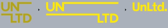
The capitalisation of the UN and separation of the ‘UN’ from ‘LTD’ in our original logo, were deliberate creative decisions, designed to help reinforce the brand purpose of UNdoing youth disadvantage for good.
The lines of the logo and visual identity bled off the edges creating a metaphor for the brand name and providing a visual demonstration of no boundaries. Creatively it was brilliant. Nevertheless, consistently we found people referred to us as ‘you en’ or ‘you-en-eltee-dee’
We undeniably own the yellow
Our simple and striking palette of three colours: yellow, black and metallic grey (along with white) has seen us keep a consistent and uniform presence in the marketplace. In the media, marketing and advertising sector, UnLtd. now undeniably owns this shade of yellow. Associations with our brand and the fact that we are the industry’s philanthropic organisation have translated really well. Our brand recognition is great.
The latest Media i study released early this year showed that, in the past 12 months, we’ve experienced a 50 percent uplift in brand awareness. The study also found that we have the opportunity to bridge the generational gap where UnLtd. recall is higher at the more senior levels of the industry – whereas Generation Y has the greatest desire to do more to give back.
Eighty-two percent of our industry has told us they want to do more, so the importance of UnLtd. is a crucial element to harnessing the power of our industry and making a difference to support the most innovative charities that deliver belief, hope and opportunity to thousands of young lives. It was with all of this in mind that the UnLtd. brand evolution had to happen.
Evolving the brand
We narrowed the problem down to: the space between the two words ‘UN’ and ‘LTD’ and also the use of the capital U and N. The ‘UN’ consistently conjured up ‘you en’ or the United Nations, instead of the intended ‘un’, which is an association with unlimited potential and undoing youth disadvantage. Even with the accompanying tagline ‘undoing youth disadvantage’ we weren’t adding the necessary context.
The case of the lower case ‘N’
The use of a lower case ‘n’ distances the brand from the possible association that it is a charity affi liated with the United Nations. We looked to adapt the existing visual identity with the aim of making the brand as a whole feel more unifi ed. It was our intention to evolve the current brand mark, ensuring that the strength of the old collateral was not ignored.
The new brand mark is a simple evolution, which is more explicit in spelling out ‘UnLtd’. while retaining a sense of character and uniqueness. This evolution helps bring together the ‘un’ and ‘limited’ while creating a more friendly and unique mark. We are also now exploring alternative taglines that call out ‘unlimited’ explicitly
Disrupting to create order
And so we arrived at a fresh new brand that remains true to our cause – but more clearly articulates our name. Our learning? When dealing with serious issues, and asking your audience to connect with a brand emotionally and altruistically, the creative execution can’t be ambiguous. The new construct ‘UnLtd.’ was selected for a number of reasons.
One was because of our new Generation Y focus. Among this audience we found it’s commonplace these days to see words shortened and abbreviated and by unifying the Un and Ltd, the ‘limited’ is translating now.
During brand testing one person said, “With the addition of a full stop I get the association with ‘ltd.’ all of a sudden, and feel like it’s clever now. Before I didn’t get it. I just knew it was something to do with charity.” Perfect result. We took a phased approach to rolling out the new brand. We determined there was no need to explicitly launch it or even highlight it in most instances.
If an individual notices the brand change, and suddenly has their own ‘aha!’ moment – then that’s exactly the impact we want to be having. For us, providing hope and support to the 91,000 kids UnLtd. is supporting in 2015 is our primary focus. We are also actively seeking CMOs, marketing directors and marketing professionals to join our mentor program to work with the country’s leading social entrepreneurs.
The full stop
People understanding what UnLtd. is about was never the issue. Our audience knows we exist to impact positive change in the world. Through a well-considered and valuable evolution of our brand mark, they now also know that our industry’s potential to undo youth disadvantage is unlimited.
Marketing is proud to welcome UN LTD as its not-for-profi t content partner. UN LTD is the only not-for-profi t philanthropic foundation representing the media, marketing and advertising community, and aims to harness the wealth, talent and infl uence of the industry, and channel this to support the most creative and innovative organisations that work with at risk young people. Visit the UN LTD website to get involved.