

Reimagining the DHS
Share
This case study details how the Department of human services adapted its brand strategy while combing four major government services. We look at the project from strategy to execution and results.
Project: Brand strategy for Department of Human Services
Client: Department of Human Services
Agency: Tank
Background
On 1 July 2011, the Department of Human Services became the master brand for Australia’s leading government services agencies – Medicare Australia, Centrelink, Child Support Agency and CRS Australia. This was a significant shift in how Australian government services would be delivered, with the overall aim to make it easier for the public to access a wide range of essential social and health services under the one master brand.
As one of the lead creative agencies working for the Department, Tank was engaged to develop the brand strategy for the reimagined organisation.
Importantly, this included a brand engagement program for staff and stakeholders and the development of graphic and communications standards.
 Objectives
Any change to government services is understandably sensitive. One of the key challenges was to create clarity within a complex brand architecture that would clearly communicate one unifying brand for the Department that encompassed each of the four agencies.
It was, therefore, critical that the new identities developed for the overall Departmental brand and portfolio of agencies had to alleviate any concerns that the provision of any government services would not be diluted by these changes. Also, communicating these changes to the 37,000 people that make up the Department would be integral to the acceptance and implementation of the reimagined brand. How to do this was a major strategic and logistical challenge.
Strategy
Research conducted previously for the Department of Human Services revealed that customers engage with government services more directly if those services are communicated around a life event the customer is experiencing. By applying these insights to the brand architecture, a range of scenarios were played out in scenario planning workshops, which heavily influenced both the articulation of the brand portfolio and content architecture.
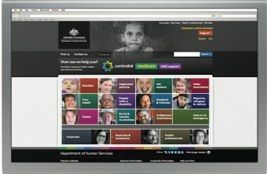
The life event model of navigating through content was adopted to allow customers a logical guide through the breadth of services available through the three main divisions within the Department – Centrelink, Medicare and Child Support. The Department of Human Services would clearly sit at the heart as the master brand, with the agencies and programs it undertakes being clearly linked to the overall brand while still retaining distinct visual elements.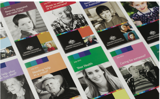
To articulate the Department’s new structure and focus in a very simple, human way, the core brand idea of ‘all our services shaped around you’ was developed. The visual and verbal identity had to communicate the Department’s single focus on shaping services to meet the customer’s individual needs and what’s going on in their life.
And it had to communicate it in such a way that staff in Canberra and across 300 offices around Australia could understand and embrace the change – well before the new identity was introduced to the public.
Their input was sought in engagement workshops where Department-wide content creators (up to 100) were invited to role-play various scenarios of articulating the tone of voice and verbal identity. Insights from these workshops fed iterations of the verbal identity development.
Execution
There were two stages of execution.
Phase One
The first stage included launching the new brand and structure within the Department through a range of presentations and internal engagement workshops, where key staff were heavily involved in the iteration of the brand development, as well as consulted for input at various points. This was a major logistical challenge given the varied requirements of stakeholders and the tight three-month project roadmap.
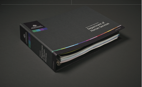
This culminated in a 400-page Brand and Graphic Standards Manual incorporating the brand story; overall visual and verbal identity; guidelines for its implementation across communications, advertising, campaigns, corporate and online; and digital templates for all applications.
To aid the launch internally, we also developed the Unity Star brandmark and visual language. Its aim was to unify a large and experienced team of service providers around the simple idea that they were now all working under the one entity – importantly, one that referenced the heritage of the Centrelink and Medicare colourways.
Alongside the brandmarks and visual identity developed, a voice was created for the Department that simplified the brand language and enabled a consistent point of reference for all content creators across the Department.
We then worked with the various teams inside the Department to create a system of presentations, workshops and mentoring tools, to engage both staff and those who were to deliver and evolve the new brand identity in the first weeks of it going live.
With more than 600 people involved in the brand engagement plan, we empowered a group of ambassadors to act as guardians and custodians for carrying the brand strategy forward and bringing it to life in their day-to-day operations.
Phase two
In the second phase of execution, the Unity Star moved from an internal symbol to the public face of the Department linked to its service delivery brands – Medicare, Centrelink and Child Support – and a sign of the new era for the Department. This was an important part of the staged execution allowing the staff and public time to understand how the Department was now structured and to alleviate any concerns of diluting services.
Results
Two years on since its launch, and the Department has successfully transitioned four distinct organisations into one health and social services delivery agency.
The staged strategy was critical to transferring thinking from a single agency model to a one-stop shop portfolio service delivery. It helped achieve a number of important objectives for the rebrand:
- The employee engagement program, including brand workshops and the introduction of the Unity Star brandmark, resulted in 100 percent awareness internally for the new branding and universal support for the changes,
- Changed the identity of employees from single agencies to ‘we are Human Services employees’,
- The new tone of voice transitioned employee language to plain English and consistent terminology instead of legislative speak and varied references for the same thing,
- Maintained strong customer support of the Department’s services throughout the changes by retaining the service brands customers recognise,
- Reshaped how the Department delivers customers’ service expectations: multiple transactions from one venue versus single transactions from multiple venues,
- Modernised the look and feel as well as the tools used in service centres to deliver customer services,
- Successfully transitioned to digital first branding versus previously printed information branding, and
- Over 1000 pieces of organisational collateral were seamlessly updated including the complete transition of the new look and feel across all publications.
The reimagined Department of Human Services required a major organisational shift – not just in how it would look, but also how it would think and act. This was critical for employees and the public alike to accept and embrace the changes.
Its successful transition has resulted in a more unified and integrated Department and, importantly, a Department where its ‘services are shaped’ around the public to make government services more streamlined and simple to access.


