Etto street pasta brand creation
Share
Campaign: Etto brand creation
Client: Etto
Agency: Truly Deeply
Background
With quick service traditionally limited to burgers, chicken and pizza, Etto is not only another offer, it is reshaping the category and introducing Italian street food to Australians. Truly Deeply partnered with Etto’s founders to help realise a vision, shape the business and create a thriving brand-led offer.
Pasta is a much loved food, but has previously not been offered in Australia outside of restaurants serving Italian food or sandwich bars serving a D-grade product to lunch-time office workers. There was a gap in the market for a new approach to enjoying fresh pasta.
The Etto founders had a vision
for a seriously good eating experience combined with a quick service time to provide a fresh, delicious and quick option for casual diners.
The concept encourages customers to be immersed in the whole food experience, by selecting their favourite fresh pasta, choosing from big flavour sauces and
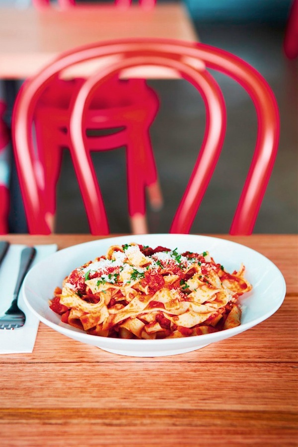
then watching it being cooked to order in minutes with love and passion. The menu includes the classics like a slow cooked bolognese, and wagyu meatballs, along with authentic Italian tastes like black truffle and salami. Most of Etto’s pasta is made fresh in store each day with a focus on fresh and premium ingredients.
Objectives
With no existing formula for quick service fresh pasta in Australia, we needed to create the category as well as the brand to educate the market about this new eating proposition.
Pasta is inherently Italian, and the spirit and passion of Italy is closely associated with great pasta, yet none of the founders are Italian. We had to tap into the Italian spirit in a way that was fresh, but also authentic and honest.
The brand also needed to appeal to the multiple and diverse audiences, from inner city urban dudes to local families out for an affordable evening eating experience.
There was also an ambition to make this a multi-store brand, without looking like a typical franchise. It was a delicate balance between creating a unique and easily recognisable brand visual language without looking like a ‘cookie-cutter’ franchise.

Strategy
Pasta is the hero. The common theme throughout all of our research and strategy development was ‘pasta’.
Pasta is at the core of the offer and we believe that the brand can own pasta in the quick service food market. This insight led us to take our fresh pasta making into stores as a key proof point for the brand.
The spirit of pasta also provided missing Italian authenticity. While they’re not Italian, the founders’ passion for pasta allowed us to capture the spirit of Italy – what’s not to love about riding a Vespa, drinking chianti on a warm evening and talking with your hands?
The opportunity was to position fast, fresh pasta as something that did not require compromise. It could be cooked to order, with a waiting time acceptable to the busiest of people.
The name ‘Etto’ is inspired from an Italian cooking measure of 100 grams, which is infused into the brand experience with every serve of pasta being a generous interpretation of an etto.
Every key decision was brand led. The brand strategy captures and defines the spirit of the brand with the right layers to drive the brand design, store design, and staff recruitment and training programs.
Ever since the Ancient Roman days, Italians have demonstrated a love of being out
on the streets – strolling with friends and families, creating and sharing in a natural energy that reflects their love of life. As a consequence, the streets have always been the perfect place to partake in the favourite Italian pastime: eating.
It is this idea of great food on the go that has inspired the Etto essence of ‘delectable Italian street food’.
Through the brand’s mind-set, we identified and implemented the philosophy of ‘Pasta Respect’. This has provided the opportunity to build a culture around being the experts in this category. From understanding the product like no one else, to importing the best quality Italian pasta making and cooking equipment, Etto rates respect for pasta above all else.
Etto staff are trained in the craft of making pasta from scratch, cooking to al dente and matching the perfect harmony of pasta and sauce. Once qualified, Etto employees earn the title of ‘Maccaronari’ – masters of their craft and the pasta equivalent of the barista.

Execution
The Etto brand identity needed to capture the spirit of Italy without being cheesy, or claiming false authenticity. There was also the added complexity of maintaining an edge to the design when repeated through multiple store locations.
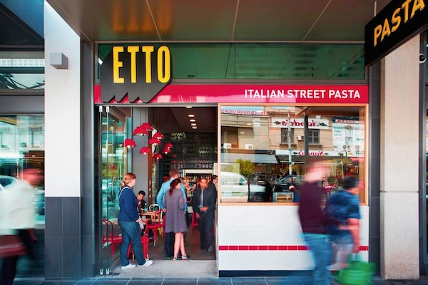
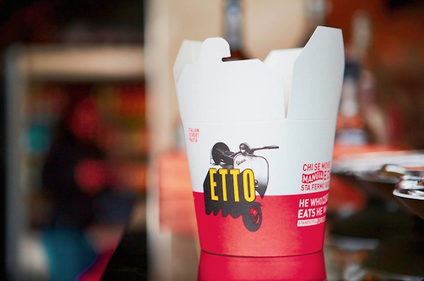
At the heart of the brand identity is the Etto word mark. The mark is based on the three-dimensional typographic signage common to restaurants and bars throughout Italy. The black and yellow colours featured in the mark reflect an urban brand with vibrancy and energy, a brand that is connected to tradition while also being current and contemporary.
The secondary visual language has a number of elements that provide the flexibility to be shuffled through varying applications of the brand, while remaining unique and highly recognisable in the market. This includes a palette of fresh, vibrant and slightly quirky colours, a graphic pasta pattern, a harlequin check pattern used predominantly in the store environment, a range of reconstituted Italian visual icons, and a highly identifiable, typographic messaging style.
This design strategy provides the edge and freshness for a large-scale retail brand rollout, while avoiding the ‘cookie-cutter style franchise’ image.
Truly Deeply developed the Etto brand from the ground up and from the inside out. Being involved with the business from its inception meant the brand was present at the table through every discussion and facilitated the best possible environment to build the business.
Truly Deeply led the strategic positioning of the brand, brand definition, naming, product development, brand identity, store design, packaging, signage, stationery, menus, environmental graphics, uniform design, marketing strategy, local area marketing, promotional campaign development and execution, website design, social media strategy and activation, brand voice development and messaging, employee brand engagement and training.

Results
Etto launched in January 2013. From the day it opened its doors, the brand and store design have drawn customers from the street in their droves. Since opening, Etto has served nearly 20,000 plates of pasta.
Etto hit its budget on just day two of business with customer numbers increasing since then.
Growth in customers and sales has been encouraged through word of mouth and a very strong response by food bloggers. Etto has a 92% rating on Urbanspoon, which is high and speaks of the quality of the pasta and sauces relative to the $10 to $13 price point.
Interestingly, while Etto has been defined as being in the ‘quick service food’ category, customers and food reviewers alike respond to it more as a quick Italian café or restaurant, which is a measure of the calibre of the food and store design.
The Etto business is running at 200% ahead of projections for the first months of operation.


