Microsoft’s new logo – the first in 25 years
Share
For the first time in a quarter of a century, technology giant Microsoft is changing its logo.
The new logo is in line with the new design direction of Windows 8 and Windows Phone 8, known as Metro (officially Windows UI), the tiled interface of which is a radical departure from previous Windows products. Windows 8 is scheduled for an October launch.

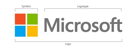
General manager of brand strategy, Jeff Hansen, revealed the new logotype and symbol combo, the first time a symbol has been part of the company’s official mark: “It’s been 25 years since we’ve updated the Microsoft logo and now is the perfect time for a change. This is an incredibly exciting year for Microsoft as we prepare to release new versions of nearly all of our products. From Windows 8 to Windows Phone 8 to Xbox services to the next version of Office, you will see a common look and feel across these products providing a familiar and seamless experience on PCs, phones, tablets and TVs.
“This wave of new releases is not only a re-imagining of our most popular products, but also represents a new era for Microsoft, so our logo should evolve to visually accentuate this new beginning,” he wrote in a blog post.

Starting today, the new logo will be used prominently on Microsoft websites, advertising and marketing material and is being rolled out at the company’s US retail stores already.
“Fully implementing a change like this takes time, so there may be other instances where you will see the old logo being used for some time,” writes Hansen.
The typeface used in the logotype is the Segoe font, which Microsoft uses in its products and marketing communications.
The video below unveils the new look:


