Top trends in packaging design for 2016
Share
As packaging trends change, it’s important for brands to ensure their offerings are presented in the most attractive way possible to remain current. Taby Taylor-Ziane runs through the top packaging predictions for 2016.
 Let’s hear it for 2016, the year of the monkey, a leap year, an Olympic year. Optimism is definitely a key driver of 2016 and with so much to look forward to we almost didn’t get round to our annual packaging design trend predictions. So let’s stop monkeying about and leap straight into it.
Pop out
Pop art is a big, bold inspiration for packaging this year. The antithesis to the over-earnest artisan trend, people are craving amusement and opinions and brands can express themselves with this edgy colourful artistic style.
Shape up
No, we’re not talking about hitting the gym (although we probably should). This year will see the explosion of Geometric shapes and patterns making their way onto packs. It allows for an explosion of colour, but in a rigid form, communicating happy through controlled chaos.
Ultra pure
Purity will be rocking it on packs in many forms in 2016. Here’s why: pure is the new natural, keep it simple, clean and lean to resonate with the ‘wellthy’ crowd. Also, people are overwhelmed every way we turn, so purity of design and messaging should rule the day.
Story style
Illustration has been creeping onto packs over the last few years, but smart brands will own their own illustrative style that will become an integral part of their brand story. People’s appetite for narrative is timeless, which is what your illustrations should be.
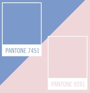 Punchy pastels
Colour-wise we will see pastels that pack a punch. No longer the remit of babies and lavender grannies, pastels are cool and should be used with unapologetic abundance for full effect. They communicate a soft assertiveness driven by internal confidence, brash, showy brands should not apply
Feel me
Tactile packaging will continue to grow, capitalising on the flat and mat trend we saw last year, brands can add much to their experience through sensual forms and packaging is a key way to sensually engage your market.
Hyper-real
Having reached peak artisan, where to next? We predict some brave brands will embrace the hyper-real, polished luxe feel that is at the other end of the design spectrum where fantasy meets technology. Game of drones anyone?
Luxe white
Black is no longer the shorthand for premium, it’s all about white. In line with people’s desire to ‘lighten up’ in all parts of their life, white is like a beacon of hope at the end of a long dark tunnel. We all want something to look forward to, in 2016 white and bright is at the peak of our hopes and dreams.
Taby Taylor-Ziane is strategic director at Boxer & Co.