Uber’s new rebrand celebrates cities
Share
Uber has drastically altered the appearance of its icons and logo, as part of a new rebrand designed to better reflect the company and the cities it serves.
Uber’s logo is now bolder, slightly more rounded and tighter.
It’s not a massive change from the old logo, but still bears a noticeable difference.
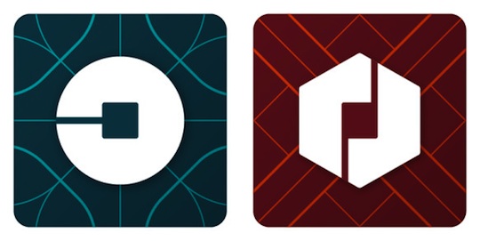
However, the new app icons are drastically different from the predecessor.
Riders and drivers will now see different icons, depending on the way they use the service.
Previously, both riders and drivers were shown a dark blue icon with a grey “U” symbol inside.
The app icons currently have a circular shape (for passengers) and a hexagonal shape (for partners) and both Uber’s new ‘bit’ concept in the centre.
All icons will differ in colour and pattern, depending on the users location.
For example Ireland’s design features lots of green colours, while China’s is heavy on red.
The long term goal, according to Uber, is to have individual icons for each city operates in, not just the countries.
The new design is based on research Uber conducted itself over a period of months as it tried to get a greater understanding of the unique aspects of each city it serves.
Uber CEO and co-founder Travis Kalanick says the result is an authentic representation of the countries in which Uber operates.
“The team has spent months researching architecture, textiles, scenery, art, fashion, people and more to come up with authentic identities for the countries where Uber operates,” Kalanick says.
Uber has also introduced a new concept called ‘the bit’ which is featured throughout its design framework.
The idea behind the concept is to put Uber’s technology front and centre, highlight information and provide consistency, making the brand easier to recognise.
Uber began as a car service for 100 friends in San Francisco, today the company is a massive transportation network covering 400 cities in 68 countries.


