Google’s Material Design: the real made virtual, made real
Share
![]() This article first appeared in Marketing’s sister publication, desktop, which explores the culture of design.
This article first appeared in Marketing’s sister publication, desktop, which explores the culture of design.
—
Google’s new digital design language, dubbed ‘Material Design’, incorporates a virtual interpretation of paper’s tactility. Tom Crabtree, creative director at Manual, tells us how his studio translated the digital philosophy of Google’s guidelines back into a unique piece of printed paper promotion for the initiative’s launch.
We thought there was something quite beautiful and apt about creating a printed interpretation of a digital interface that was originally inspired by print design. It’s like bringing the project full circle.
Our brief was quite simple: to design a printed ‘kit’ to be distributed at the Google I/O Conference in San Francisco that celebrated Google Material Design. The printed piece needed to communicate the digital design intentions, but also needed to provide a sense of utility – so there was an element that would be ‘useful’ to designers and developers attending the conference. The brief was open: it could be in any format – poster, book, cards…
But it also had quite an aggressive timeline! We had six weeks, in total, to design it and have thousands of copies printed and delivered to the conference.
Seeing the design studies that the UXA (User Experience Architecture) team had put together while creating Google Material Design was the starting point for us to understand their intentions. They really did look into the physicality of paper – its depth, layering, light and shadow, within the design of Material Design. They even made icons out of paper (such as the Gmail icon) and photographed them to see how light and shadow played. We were very impressed by the thinking that had gone into Material Design, and wanted to honour their work as best we could. We really took this framework as the sole inspiration for the design of the printed piece – we didn’t want to add any other layers of ‘style’.
I can’t think of any other technology brand that has invested this much thought into its role in shaping user interface design. Not only did Google make a beautiful website of well-articulated and detailed design guidelines, but it also invested time (and money) in communicating its design intentions and principles in a printed form, which showed its commitment to good design.
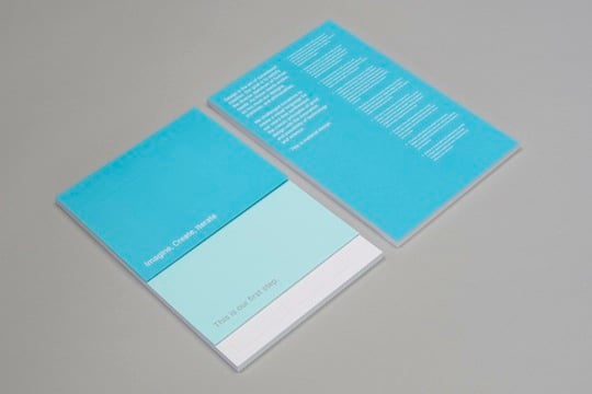
Colour was one of the most important aspects of the project and became a defining feature of the piece. We wanted to celebrate the vibrant colour palette defined in the digital guidelines, but we also looked to ensure that there was some level of consistency and tie-in with the overall launch of Material Design.
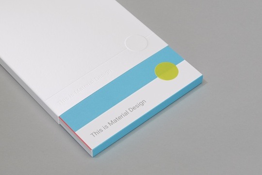
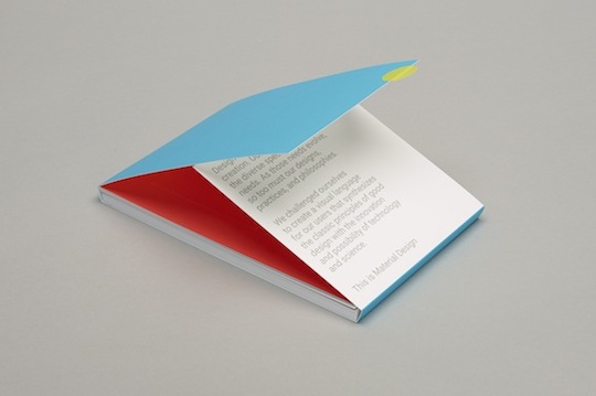
We decided that the ‘outer experience’ of the kit should be neutral, and the colour should ‘build up’ as you open the piece. So we kept the outer sleeve completely white, with only the title blind debossed into the sleeve. This way, only light and shadow revealed the title.
When you remove the package from the sleeve, the cyan/lime colour combination that is used in the introductory title page of the Material Design website is revealed. This palette also tied in nicely to a Carl Kleiner image that Google had commissioned, and we were in love with.
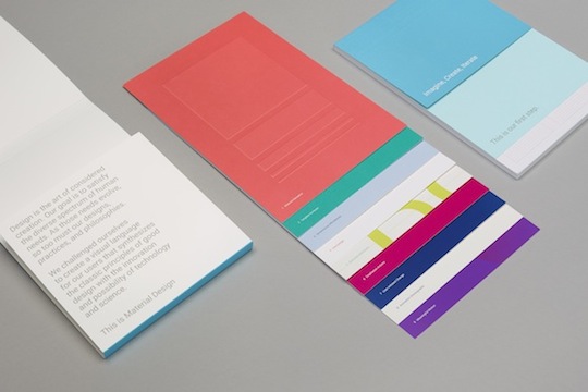
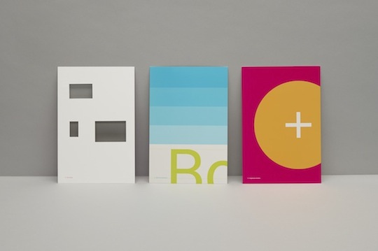
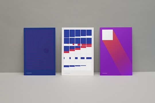
The set of nine postcards we designed took a freer approach to colour: we mixed palettes, using both primary and secondary colours, to provide a good sense of pace and avoid repetition. We treated the cards with more of a ‘colour blocking’ approach. Our client was OK with us departing from the rational use of colour as defined in the design guidelines, so we treated the cards more as ‘art cards’.
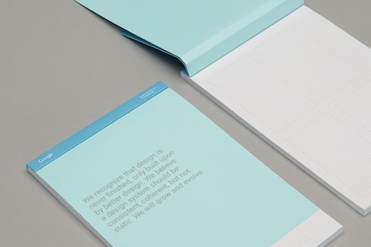
We only had a week to lock down the format, so we made decisions quickly. From the beginning, we knew we wanted part of the kit to provide a sense of utility, so we proposed a sketchbook that attendees at the conference could use in work sessions, or use in the everyday. Our client had the great idea to print user interface grid templates on the pages (mobile, tablet and desktop grids), so the sketchbook was designed primarily with the user interface designer in mind.
We had the idea of a large foldout poster as part of the kit – either wrapping around the sketchbook, like a dust jacket, or inserted into a pocket. But we collectively discarded this idea as we felt it could be cumbersome, and the multiple folds would not allow a user to hang it on a wall, so it would be less than elegant. Instead, we settled upon a simple set of cards that communicated the core design principles. The individual card format felt appropriate given the nature of ‘cards’ being used in Google’s user interface or UI (Google Now, for example) and rectangular screen-based nature of the project.
We wanted layering to be a key part of the experience, so, with the sleeve removed, the inner package uses layering to reveal the introduction statement, with a sticker being used to seal the package. The postcards themselves were layered one on top of the other, and we used layers in the design of the cards – embossing, hand applied card and die-cuts. Finally, the sketchbook cover has a layered treatment with two cropped pages acting as the cover, and revealing messaging.
All design decisions were made in close collaboration with our client, Jonathan Lee (Design Lead at Google UXA team in New York). We were very much creatively aligned from the start, so decisions were easy and quick (and the timeline also had something to do with it!).
I think the demise of newspaper and magazine publishing tells us that traditional media is not exactly in a romantic phase. I think we, as designers, have a tendency to cling to print, but I don’t know if the rest of the world feels the same way.
That said, it’s undeniable that when you hold a special piece of print or packaging that has been lovingly designed and produced, there is a sense of familiarity and delight that you don’t often get through digital media.
I think what’s interesting about Material Design (and likewise with apps such as Storehouse and Paper), is that they attempt – in quite a simple and elegant way – to bring this familiar and delightful experience to the screen. I have a hunch that these projects and apps are often led by ex-print designers or, at least, designers with a strong affinity for print design.
—
Project credits
Tom Crabtree, creative director/designer, Manual
Eileen Lee, designer
Caroline Reece, designer
Jerod Rivera, designer
Tanner Irwin, designer
Amanda Downey, project manager
Patricia Callaway, client services/production manager
Celeste McMullin, print broker
Printed by Oscar Printing in San Francisco
—
This article first appeared in Marketing’s sister publication, desktop, which explores the culture of design.