Introducing The Connect Issue – Marketing magazine in 2015
Share
UPDATE 1 Dec 2014 6:07pm: Voting has now closed. Thanks to everyone who participated in the poll. Find out which design won when it adorns the front cover of the magazine in February (subscribe to get it first).
Marketing will look completely different in 2015: the magazine, the website, and the… other stuff we haven’t announced yet. And we want you to help choose the very first cover of the print mag.
Starting in February, Marketing‘s print magazine and online channels will follow a theme: a rallying point around which the content in the magazine and on the website will focus.
First up, in February and March 2015, we will be obsessed with the word ‘Connect’.
That means the February-March 2015 issue of Marketing will be ‘The Connect Issue’. Think internet of things, emerging media, networking, brands that connect, marketers who connect… any way you can interpret the word ‘connect’ in a marketing context is fair game.
So, since the cover of Marketing is the window into its contents, a banner to embody the area of investigation, and a symbol of the Marketing brand, we want you, the reader, to help us choose what it will look like.
We invited creatives from some of Australia’s top agencies to pitch their cover designs. They were given the theme of the issue and just a few days to sketch an idea.
Below are the designs they came up with. They’re all great – thanks to everyone who entered – but only one can be the cover.
To keep it interesting, we won’t reveal which entry is the winner until it emerges in its full glory on the front of the magazine in February (subscribe here to never miss an issue).
Check out the entries and vote in the poll
Click on any image to enlarge it.
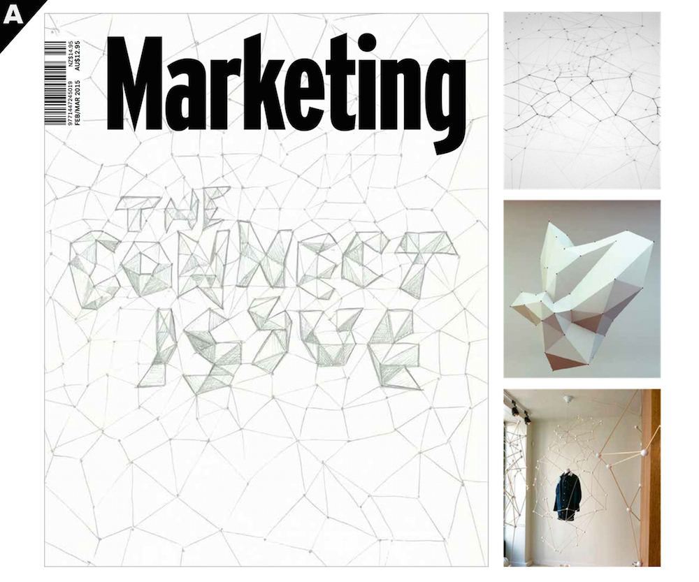
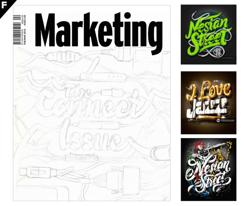
“A diagrammatic and 3D approach to create the type that forms and announces ‘The Connect Issue.’
“[Top-right] The pattern shows depths of and random nature of connections.
“[Centre-right] Type treatment ‘The Connect Issue’ stems from the pattern.
“[Bottom-left] The interaction with the masthead. The pattern goes in front and behind.”
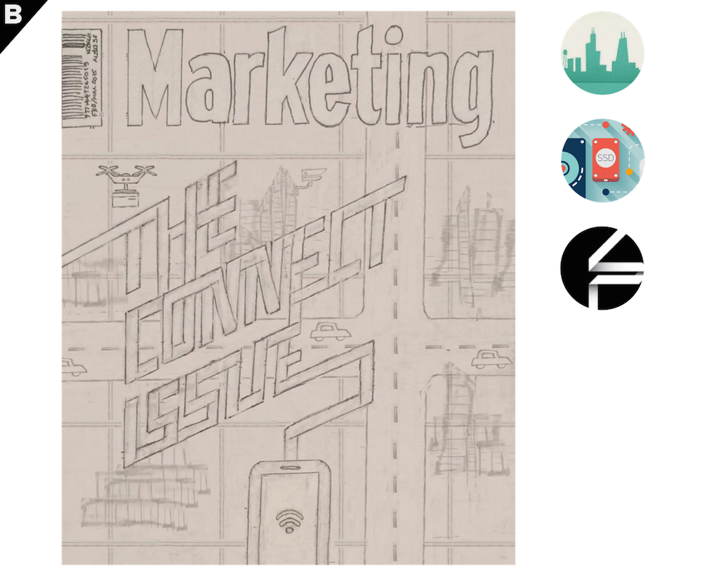
“A typographic/illustrative piece, this concept uses the viewpoint of a smart-phone user looking down upon, and connecting to a miniature city below.
“An illustrated, slightly futuristic cityscape is connected together by a series of interlocking grids, each featuring a scene that represents an area of innovation within the connected world such as a fleet of remote controlled drones on their way across the rooftops to deliver packages.
“The issue title ‘The Connect Issue’ sits above the illustration and is formed from a series of intertwined lines flowing from the device at the foot of the page, creating a striking composition.
“To avoid overwhelming the page simplistic illustrative style will be used with a purposely restricted colour palette and subtle shading to create harmony across the layout.”
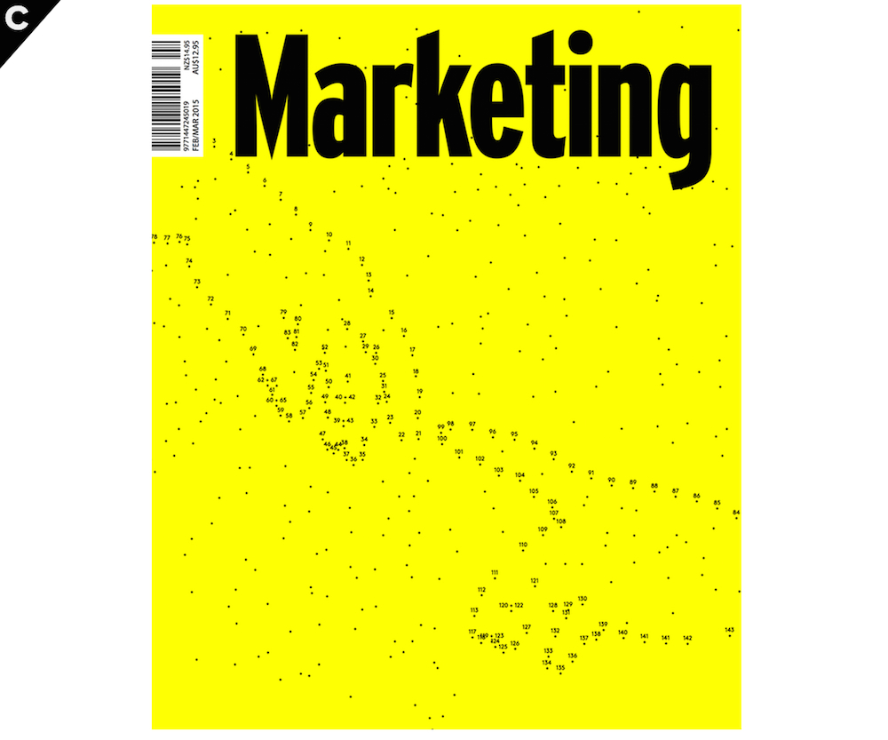
“We’re constantly inventing more and more ways to communicate with each other. Ironically, however legitimate human connection is in rapid decline. This concept comments on the limitations of digital connection referencing perhaps the ultimate digital connection – Michelangelo’s iconic ‘Creation of Adam’ that adorns the Sistine Chapel.”
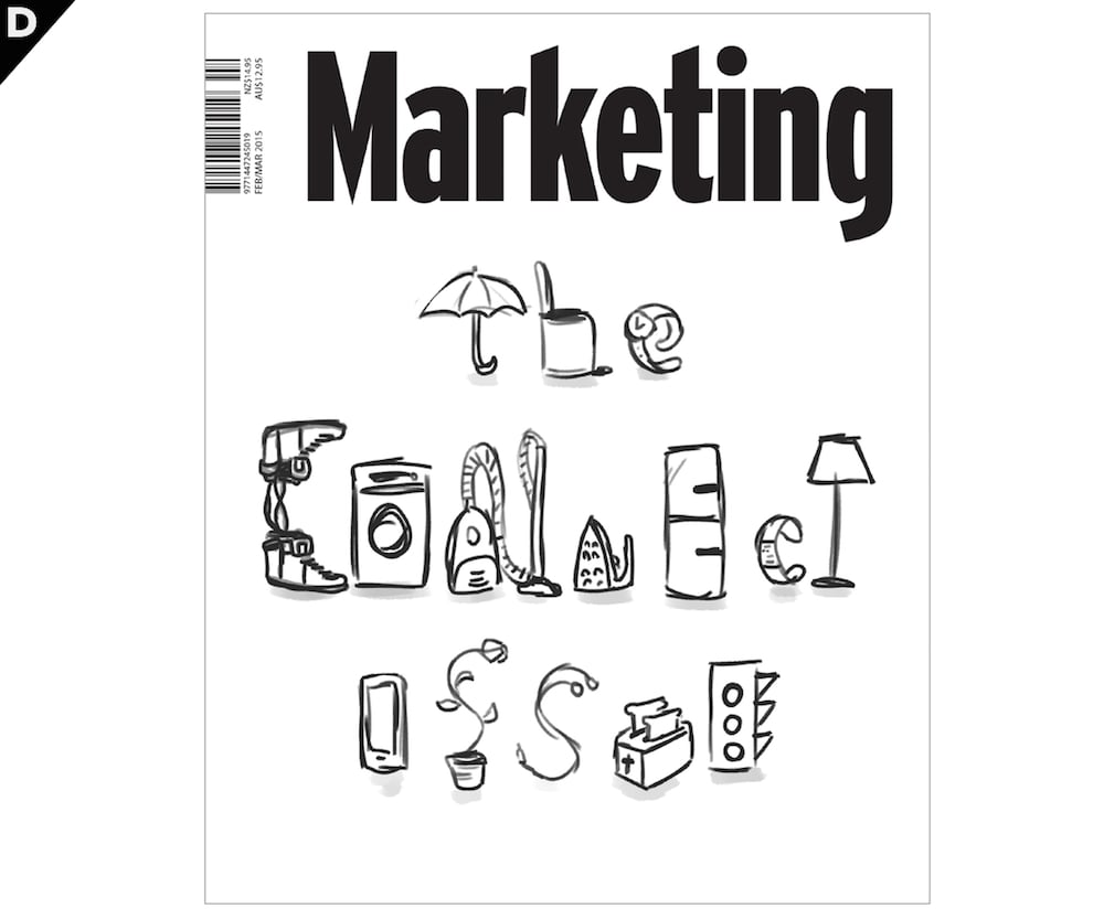
“Everything will be connected. ‘The Connect Issue’ is created with objects that have the potential to become ‘smarter’.”
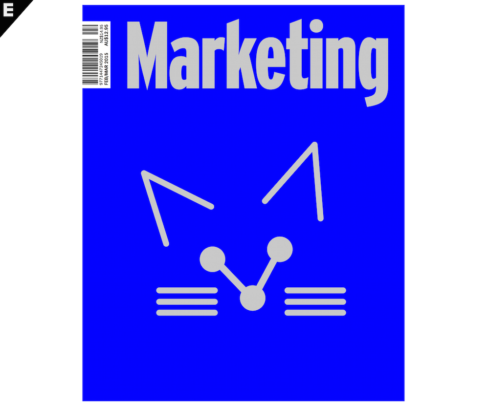
“The internet today reaches more people in more places than anything ever has. People connect through the sharing of information, stories, selfies, gifs, and most importantly – cats.”
“Using cables, USB’s and various cords and plugs from technology and devices, we create a distinctive typographic approach to announce ‘The Connect Issue’.
“The references show a bright, fun look with the subject blended in with the type.”
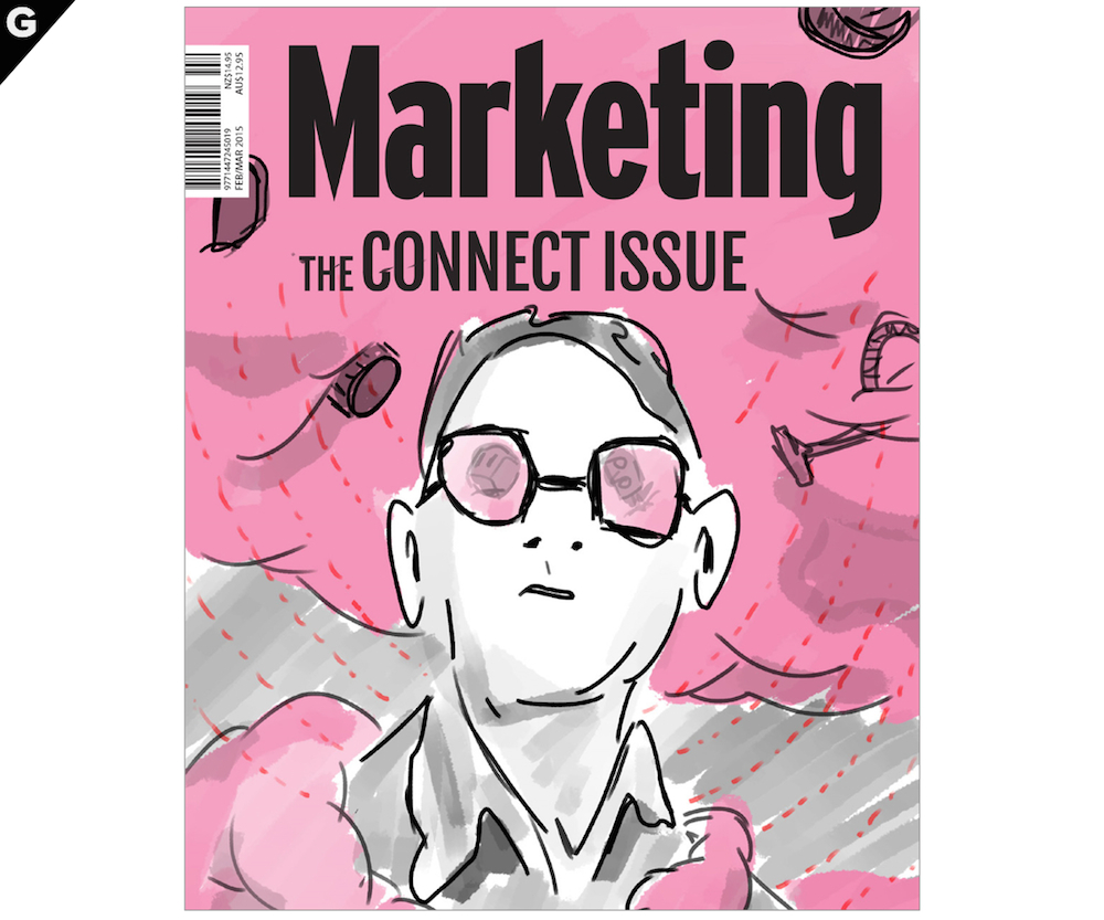
“All our things will be in the cloud.
“Someone looking into the cloud to find that all of his possessions are there, things you wouldn’t normally expect; the bin, vacuum cleaner, fridge, toaster etc.
“The cloud looks very dense and very full, it looks like it goes on forever.”
Vote for your favourite
To help it become the cover of the February-March 2015 issue of Marketing.
[polldaddy poll=8486219]

