Industry fund MTAA Super rebrands with bold, progressive identity
Share
MTAA Super has revealed the major redesign of its brand identity.
MTAA Superannuation Fund (MTAA Super) has revealed its new look, which aims at “reflecting its purpose to be a driving force in securing financial futures for Australians”.
It’s a transformed identity using a single master brand that displays a more progressive, strong and performance-focused entity to internal and external audiences.
The rebrand is part of a five-year strategic plan to reposition the national industry-based superannuation fund for the motor trades and allied industries, as well as target the retention of current members and generate increased appeal from prospective members working in the motoring industries and small businesses. It also aims to be attractive to potential clients exploring the investment category.
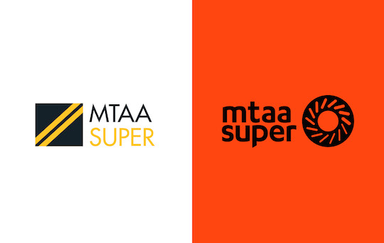
Here’s the before and after comparison.
The new branding made its first major public appearance two weeks ago in a TVC starring motor sports champion Craig Lowndes.
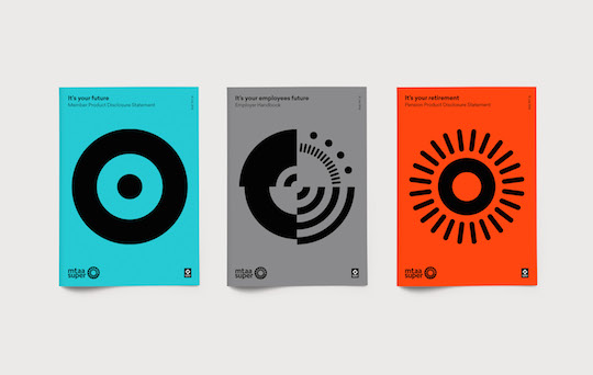
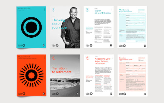
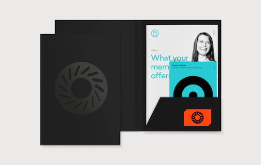
The identity and visual language were created by branding agency Hulsbosch, which worked on a full suite of brand applications including marketing, business development and event collateral including brochures, fact sheets, invitations and banners, as well as internal communications material such as templates and stationery. A new set of brand guidelines supports the rollout.
“The motor trades and allied industries are very diverse but a factor they have in common is the need to continually evolve,” says Leeanne Turner, CEO of MTAA Super. “Our program of change across all aspects of MTAA Super operations are focused on competing head to head with industry and retail superannuation funds in Australia.
“I’m delighted with the outstanding guidance and passion from the Hulsbosch team. The rebrand will inject renewed marketing vigour enabling us to stand out and fulfil our ambitions for the future.”
Creatively, the brief involved a complete audit of brand materials and their use and purpose for communications. Also a comprehensive category review that revealed ‘sameness’ or a homogenised look and feel of the superannuation category.
A priority of the project was an easy to view, straightforward branding that provided a variety of possibilities for use across a range of applications and platforms.
“We broke from brand elements of the past such as the old imagery, colours, copy writing and typography and found ways to make MTAA Super unique and stand apart in category,” says agency director Jaid Hulsbosch.
“Our solution also strips out all the financial services and superannuation jargon to strengthen and consolidate the messaging. To overhaul how the brand speaks is a powerful part of its rejuvenation and we have revealed a tone of voice that reflects its optimistic and straight-talking personality. It was time to rebuild and reconnect the brand with its members. This is a significant change in direction that will have the industry taking note at an extremely competitive and critical time.”
MTAA Super was established in 1989 and has 26 years’ experience in managing members’ retirement savings. MTAA Super manages $9.2 billion in funds under management as of 30 June 2016 and with approximately 250,000 members is the highest rated mid-range Australian superannuation.