Top10 Australian logos of all time
Share
Top10 Australian logos of all time
The votes are in!
Marketing, in collaboration with sister publication desktop magazine, is pleased to announce our Top 10 Australian logos of all time. Hundreds of nominations were polled from desktop‘s online readership, then the final 10 decided by our expert panel (no self-voting allowed, of course). Some logos you will love, and there might be a couple you hate, but one thing is for sure, the following pages offer a fascinating insight into the history, trials and trivia of some of Australia’s favourite (and sometimes controversial) brands and their logos.
The panel:
 Andrew Ashton
Creative and client services director
Work Art Life by Studio Pip and Co.

Ken Cato
Chairman
Cata Purnell Partners
 Mark Gowing
Founder
Mark Gowing Design
 Hans Hulsbosch
Creative director
Hulsbosch
Creative director
Re
 Zoë Pollitt
Director
Eskimo

Fiona Sweet
Creative director
Sweet Creative
The logos:
10. SBS
The first SBS symbol to hit the screen was a gradient blue and white globe surrounded by a blue and white ring. It was used across all of SBS’s stations and symbolised transmission of the VHF channel. Channel 0/28 was renamed Network 0-28 in 1983 and this coincided with a new logo that featured the new name directly underneath the globe. In 1985, Network 0-28 was renamed SBS TV and an updated logo featured the letters SBS underneath the globe. In 1989, the trademark was again updated with the globe removed.
Introduced in 1991, Ken Cato’s trademark for the multicultural television station was developed by literally opening up the globe. The pointed ellipses of the SBS symbol are a translation of opening up the globe – this is the traditional way of drawing the world, if you flatten it, known as a Mercator map.
According to Cato, the idea behind the trademark came up at a briefing session with SBS. “I’m a great believer that most clients will tell you what they want if you listen carefully enough – they are pretty smart people, but often don’t know how to translate their thoughts into a workable idea,” he says.
Former SBS director of marketing and current Marketingmag.com.au blogger, Jacquie Riddell, believes Cato’s logo was incredibly clever. “Ken thought long and hard about it,” she says. “The 23-degree tilted angle of the logo represents the angle in which the earth tilts and the level of detail in which it was designed manifested abstractly and beautifully on screen.”
Because the marque was celebrated for nearly 20 years, Riddell explains that the more recent May 2008 redesign (pictured) – with the slogan ‘Six Billion Stories and Counting’ – paid homage to Cato’s original creation. “SBS wanted to protect its integrity, so Kevin Finn’s logo design kept the Mercator map and is a more simplified, streamlined version,” she adds.
Finn’s new typemark design enlisted a lighter-cut Helvetica Neue typeface, which was demerged from the symbol. “One practical issue against keeping SBS inside the Mercator map becomes evident when reducing the identity marque to small sizes, since this compromises legibility and limits minimal size,” Finn explains. “The decision was made to remove the type component from the symbol to help alleviate these limitations, but also to free up the Mercator map icon which, if necessary, can be used without [the letters] SBS,” he says.
9. AUSTRALIA POST
The post office is Australia’s oldest surviving commercial enterprise and until 1975 was known as the Postmaster General’s Department. At that point, it was split into two companies: Telecom Australia and Australia Post. The national postal service was in dire straits, running at a loss and with a damaged public reputation. The split was the recommendation of an inquiry into sluggish government bodies in urgent need of reform. Australia Post had public confidence to win back and revenue to raise.
To celebrate their new, separate identities, both companies were bestowed with a logo designed by another national treasure, Pieter Huveneers. A Dutch émigré and widely known postwar graphic artist, Huveneers had already worked on the corporate identity of a vast number of major European companies, including General Electric Company, British Railways and Pepsi Cola. Most interestingly, he designed a series of delightful posters for the Great Britain Post Office throughout the 1950s, qualifying him with a particular pedigree for the task of the Australia Post logo.
His neat solution has remained the symbol of the postal service across the country bringing together history, tradition and modernity. The bright red ‘P’ for ‘post’ smartly incorporates the image of a postal horn: the traditional instrument European postmen use to announce deliveries. According to Australia Post, Huveneers selected red in response to research that showed that the public felt the colour was synonymous with the post service. This is most likely because the colour has long been associated with Commonwealth services. The encompassing circle is said to symbolise the worldwide reach the service offers.
The subtle Australia Post pictogram is stamped with the designer’s aesthetic and yet, after all these years, it has become so ubiquitous, it’s as though it belongs to every Australian and it now stands for all the values that, back during the 1975 split, the organisation was seeking to reassert – trust, community, honesty and dedicated service.
“We’re immensely proud of our logo, which has included the post horn symbol (‘P’) for almost 40 years and is so familiar to Australians today,” says Mel Ward, media and communications manager of Australia Post.
“Our logo can be seen on almost every street corner on street posting boxes and on the thousands of Australia Post motorbikes, vans and trucks that deliver the mail to 10.9 million addresses every working day.”
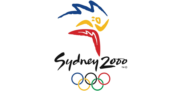
8. SYDNEY 2000 OLYMPIC GAMES
The Sydney Olympics captured the world’s attention for two weeks in September 2000, but it held Melbourne design studio FHA Image Design captive for seven years.
“Nothing could have possibly prepared me for the Sydney 2000 Olympic Games brand identity project,” wrote Richard Henderson, former creative director and founding partner of FHA (now known as FutureBrand) in an article for the US’s Design Management Review. Managing the tremendous expectations of so many stakeholders demanded that he move from Melbourne to Sydney for the project, along with key creative directors Ken Shadbolt and Trevor Flett, who flew in with a team of leading creatives.
In 1992, the organising committee invited several designers including Ken Cato, Ken Done and Michael Bryce to submit designs for the games logo. Bryce’s logo, which featured stylised Opera House sails, was declared the winner and used as the bid logo.
When those famous words were uttered in 1993 – “And the winner is… Sydney” – a second competition was held, and FHA cranked into overdrive to produce the full spectrum of design required for every aspect of the Games.
Additionally, FHA was determined to “dispel tired and quaint clichés of Australia,” namely, Henderson says, koalas and kangaroos. “I wanted our design to engender pride in Australian creative quality and optimism for the new millennium that the Games would herald.”
Applying the critique of SOCOG, the team sought simplicity and “endeavoured to design a mark that a child could draw in the sand.” The result won the judges’ approval and, in December 1995, on Shadbolt’s birthday, the agency received the call to say that the ‘Millennium Man’ design had won.
The trademark depicts the image of a running athlete outlined in a handdrawn style, again referencing the human aspect of what the Olympic Games stands for. He is cleverly configured out of three boomerangs, referencing, in a contemporary and imaginative way, motifs that the international community recognises as typically Australian. He holds an Olympic torch from which trails a line of smoke that draws the iconic white peaks of the Opera House. The flowing handwriting typeface for ‘Sydney 2000′ – called the ‘spirit script’ – was employed as a stand alone sub-logo.
7. NINE NETWORK
Produced and used across the metropolitan stations in 1970, the Nine Network trademark was originally designed by Brian Sadgrove and first featured a numeral nine beside nine dots.
His original trademark has withstood the test of time, remaining in use on the Nine Network in differing forms across the decades. In 1975, television in Australia switched from black and white to colour transmission. The nine dots were originally conceived to allow for a multicoloured mark; however, in 1977, they were removed, but only for on-air idents. This lasted until 1988, when Bond Media purchased the network and reinstated the nine dots.
“To be honest and from a design point of view, I must say that I never much liked the logo, but it seems to have become a part of Australian culture,” says Sadgrove.
On 30 January 2006, the network and its affiliate stations relaunched to coincide with Nine’s 50th year of broadcasting. The decision to relaunch was made by interim CEO Sam Chisholm and late PBL deputy chairman Kerry Packer early in 2005. The new logo, designed by Bruce Dunlop Associates (BDA), used a 2D blue square with the numeral nine inside and lacked those distinctive nine dots, which had been an Australian television icon since 1970. The amended version of the numeral nine basically had the strokes thinned out and the internal corners sharpened off.
In a press release issued by BDA Sydney, creative director Jens Hertzum said: “We have delivered a simple, yet strong design and have now positioned Nine as an inherently Australian brand.” We decided to use a photo-real approach for on-air ident menus. This was an opportunity to showcase Nine’s talent pool in a unique way and reflect the Australian lifestyle and landscape.”
The release continued with: “Yes, we have dropped the balls, but maintained the strength of the Nine logo design and made it more contemporary. We now have an uncluttered design that brings all our brands together.”
Sadgrove believes that the changes made to the trademark by BDA were gratuitous and inept, but concedes that, “The logo is admittedly hard to change – you either completely redo it or don’t change it at all.”
As part of a major relaunch, Nine Network reinstated the nine dots trademark in 2008. The dots were represented as 3D discs in 2008, then 2D dots in July 2009, and then later spheres in September 2009 to the present day.
6. WOOLMARK
It was 1963 when the Australian body known as the International Wool Secretariat called for submissions from the international community for a universal symbol that would stand for the quality wool it exported around the world. The successful image that is used and recognised across the UK, Japan, Europe and the US is referred to as the Woolmark. It was thought to best represent an icon which would, according to the competition announcement, “hold consumer confidence and represent quality standards.”
The winning design has its origins entangled in some contention. Although official sources maintain the creator of the logo was a Milanese designer named Francesco Saroglia, some critics have suggested that no such person ever existed. The timeless logo he allegedly crafted is the only creation ever publicly attributed to Saroglia – no other records have ever been found referencing his work.
In 50 years, the mystery has never been conclusively solved, though folklore hints that at the heart of the knot is Franco Grignani. An established Italian artist and designer, Grignani was on the judging panel of the logo competition. Popular theory has him taking a gamble by sidestepping protocol with a falsely named entry and, in the end, the winning design.
The Secretariat, now known as Australian Wool Innovation (AWI), does not entertain this speculation surrounding the logo’s mysterious original designer. “We know the design was submitted under the name of a Signor Francesco Saroglia and, while we have no evidence, as far as I’m aware, to suggest that it was a pseudonym, we recognise that there has been plenty of interesting debate about his identity,” says AWI manager of publications and public relations, Richard Smith.
In the half century it has existed, over two billion labels bearing the Woolmark logo have been stitched into woollen products. “Five black bands criss-crossing to form a skein-shape perfectly represented the softness, elegance and modernity of wool,” Smith says. “The logo’s strength comes from its graphic simplicity.”
The Design Corporation, a London-based design firm, was invited to refresh the logo with a green and blue colour palette to act as a sub-palette for environmental campaigns launched in 2011, which promoted wool as a natural resource. The April 2011 edition of Creative Review announced the Woolmark as its number one logo of all time.
5. WOOLWORTHS
The well-known trademark that united ‘the fresh food people’ for 21 years from 1987 until 2008, created by Dupree Design Group, was replaced with a new marque designed by Hans Hulsbosch and includes a green icon incorporating a stylised ‘W’ for Woolworths. It is reminiscent of one of the Woolworths logos seen in the 1970s and represents a person, as in ‘the fresh food people’ slogan.
In September 2009, the rebranding was extended to New Zealand stores where the new Woolworths symbol was to be used alongside the Countdown brand. It was rolled out in Australia across some 780 stores, including the transformation of the Safeway stores (owned by the same parent company) in Victoria.
In October 2009, it was reported that Apple Inc had lodged an objection to Woolworths’ trademark application with the Australian Government’s intellectual property agency, IP Australia, claiming that the logo resembles its own. The report said Apple was concerned Woolworths had applied for a blanket trademark for the design, so it could be placed on any product – including on electrical goods such as computers and music players. At the time, Woolworths was not selling its own brand of electrical goods, but a spokeswoman for the company said, “While we can’t rule anything out, we haven’t got any plans at the moment.”
In an article published in The Age in 2009, Hulsbosch remarked on Apple’s dispute, stating that the company was taking trademark protection to the extreme. He was quoted as saying, “Based on this logic, they would have to take action against every fruit-seller.” At the time of print, Woolworths had not commented on the outcome of the Apple dispute and the logo has not been changed. Asked about the meaning behind the awarded trademark design, and what the design represents, Hulsbosch says, “The Woolworths icon is the W for Woolworths. The logo represents ‘fresh’: fresh produce, fresh food, energy and life. Green is the colour of nature, growth and organic freshness. It characterises balance, harmony and well-being. The round shapes signify friendliness, humanity, approachability and openness. The icon also represents people, a positive and energetic person with raised arms.”
In 2011, the new brand creative for Woolworths Supermarkets was named as Australia’s most valuable brand worth more than $7 billion (according to an independent report conducted by brand valuation consultancy Brand Finance).
4. COMMONWEALTH BANK
From 1921 to the 1950s, the Australian Coat of Arms was the Commonwealth Bank’s first insignia, with only a slight variation in the design occurring in 1926. During the 1950s, a dark and light blue symbol of entwined CBA letters in a circle appeared on some branch façades and stationery, but the symbol had a short-lived existence and ceased to be used after the formation of the Commonwealth Banking Corporation in 1960.
With the change in structure that took place in 1961 a new trademark was introduced. It was designed by a shy Hungarian named George Hamori, and featured the map of Australia enclosed in a black circle with three radiating rings to the right hand side. The offset rings created the idea of expansion and symbolised the Corporation’s three constituent banks – the Commonwealth Savings Bank, the Commonwealth Trading Bank and the Commonwealth Development Bank. Gold colouring of the background was symbolic of wealth and the beginnings of banking. The seven-pointed star on the left of the design represented the Commonwealth and the six states. The Corporation name was placed around the perimeter of the design, and the logo remained almost the same until 1991, with the star and surrounding words removed in 1984.
Described as “bold, strong, modern and progressive” in a bank press release, the Commonwealth Bank’s current logo was introduced in September 1991. According to the bank, the design is based on the formation of the Southern Cross constellation with the yellow section linking the five stars of the Southern Cross, and the black portion completing the geometrical shape. Yet, Ken Cato, the designer appointed in 1989 to create this new corporate identity, disagrees: “It doesn’t mean the Southern Cross; it means the Commonwealth Bank,” he says. “We needed a shape that could still include the colours yellow and black (as this distinguished us from all of the other banks’ colours) and it had to be a memorable shape in contrast to the bank’s competition and a diamond seemed like a good idea, plus it breaks up the black and yellow colours.”
The story behind the development of the trademark’s single, extended character, double M typeface is also surprising. “It simply came down to having very uncomfortable words placed together,” says Cato. “I needed to make the word ‘Commonwealth’ as short as I could. There was also a picket fence in the word where the double ‘M’ forms an awkward arch, so these were the decisions behind the joining of the letters and the legibility was not lost – only a designer would pick it up.”
3. CITY OF MELBOURNE
Australia’s cultural capital unveiled its new corporate identity in 2009 and created a storm in a café latte cup. The City of Melbourne branding centred on a bold and modernist ‘M’ logo developed by the Australian arm of Landor, which is controversially based in Sydney. Melburnian taxpayers decried the $240,000 paid for the design and slammed the ‘future-proof and iconic’ logo that Landor created. “It generated an enormous amount of opinion and articles by everyone from industry leaders to students and even cab drivers,” says former Landor creative director Jason Little.
Lord Mayor Robert Doyle dismissed the former identity as “a bit daggy”. He told media that the leaf logo (designed by Richard Henderson of FHA Image Design) belonged to a bygone era in which he was still listening to MC Hammer and that it had to go. “Since implementing its previous identity 15 years before, City of Melbourne had experienced significant change,” Little explains. Minor tweaks made to the logo hadn’t addressed the bigger issue.
It was this ‘identity fragmentation problem’ that led to the solution. The designers created a ‘shards of glass’ effect to express the diverse and multidimensional character of the city. According to Little, Landor Sydney was interested in exploring the impact the city’s new identity could have on broader issues, asking, “How could we influence how governing agencies think about themselves? Could the identity inspire action?” As a result, the logo is contemporary and controversial.
A geometric letter M revealed “a unique canvas that enabled hundreds of iterations,” which ensures the brand will withstand the test of time. Jefton Sungkar, an intern at Landor at the time was closely involved in the process. “We had the idea of constructing an M out of a grid as a very loose reference to Melbourne’s famous streets and laneways,” he recalls.
He designed a range of different solutions for how the M could look, using the idea of it being multifaceted, to being constructed out of the triangles, to looking three-dimensional. The designers criticised the initial press annoucement, which revealed the logo alone. “It did not go down that well,” comments Sungkar. “However, the second time, when the full project was released with all its different logos and its visual system, it received a completely different response.”
2. QANTAS
The original Qantas trademark, which borrowed significantly from the Australian one penny piece, has been overhauled several times since its inception in 1944. This original version displayed the kangaroo, the central element of the logo, and was illustrated below the cockpit of the company’s first Liberator aircraft.
Designed by legendary graphic designer Gert Sellheim, the renowned winged kangaroo symbol version was unveiled in January 1947 to celebrate the debut of the Lockheed L-749 Constellation aircraft and was depicted as carrying the globe with its feet.
Fast forward to 1968, and the flying kangaroo was placed in a circle and the globe was removed. This symbol was in turn replaced in 1984 with designer Tony Lunn’s modified version that saw a now more delicately stylised kangaroo lose its wings. Ken Cato, who designed the logo created for the airline’s 75th anniversary year in 1995, says he was less than impressed with the wingless kangaroo: “You could redraw it or restyle it, but the wings made it distinct and gave it a mystical, untouchable edge, which is still such a part of our history,” says Cato.
Yet another interpretation of the iconic kangaroo symbol was unveiled in July 2007 (pictured), this time designed to reflect the changing structure of the airline’s new generation aircraft A380 super jumbos. Unveiled by internationally revered designer Hans Hulsbosch, the new version was sleeker and more contoured than previous versions. Lunn however, who controversially clipped the wings 20 years prior, rubbished the logo, referring to it as ‘big foot’.
Ron Dyer, who alongside Lunn introduced the wingless kangaroo, questioned why Qantas would “waste up to $100 million changing the logo on its fleet” for what he described as an inelegant design.
The logic behind the redesign, however, is hard to argue with. Due to the no-paint zones on the A380, the foot would have gone straight through the tailplane and subsequently would have looked like a legless kangaroo.. “We never thought the design would be revolutionary, because Qantas was already regarded as one of the most recognised brands in the world,” Hulsbosch explains. “So we could never be revolutionary; it just needed to be contemporised.”
In reference to the naysayers, Hulsbosch remarks, “It wasn’t the [2008 Cannes] award that silenced the critics; it was the time and the implementation of the new contemporary kangaroo.”
1. ABC
Affectionately referred to as ‘The Worm’, the Australian Broadcasting Corporation (ABC) logo was submitted in 1965 by staffer Bill Kennard. An ABC staff competition had been running for two years in the search for a symbol for the government body. Space engineer Doug Rickard suggested a design based on the waveform of an oscilloscope. Senior graphic designer Kennard, who had been brought to Australia from his previous role as a lettering artist for the BBC, and designer John Spatchurst reworked the idea and presented their squiggly suggestion (technically termed a ‘Lissajous curve’), for which they were paid £25. The words ‘Australian Broadcasting Commission’ (as it was then known) were added to the logo and it remains Aunty’s consistently comforting visual shorthand, undergoing only a few tweaks over the past 47 years.
With the introduction of colour television in 1975, the design experienced its first facelift with the line thickened to allow for colour to be used. It was also treated to the ‘over and under’ effect, showing the crossover of the line in the design. The 1975 logo served as the longest-running design with a lifespan of 27 years. In 1998, television promotions featured Australians drawing the logo in the air.
In 2001, Harcus Design was commissioned to address the ABC identity and create a consistent and over-arching implementation across its multiple media platforms and divisions. The result was a primary monolithic identity, formed with a sinuous, three dimensional rendition of the Lissajous curve with a reflective silver finish, proudly crowning the concise customised ABC typography. The logo was applied to all applications from screens to stationery and is still in use by the ABC today. In 2008, rumours spread that the logo was heading for the scrapheap. ABC loyalists were up in arms and the network was required to issue a public statement assuaging the fears that the rumbles of digital television would squash the worm.
Last year saw the ABC logo refashioned once more to accommodate the digital television era, which saw the television channels split to ABC1 and ABC2. ABC engaged Iloura to work on the rebrand, which saw Harcus’ silver curve incorporated into identities for Aunty’s multiple channel offerings. Design director Finn Spencer says he was impressed that, “[The ABC] really stuck to that desire to make a modern mark that would stand the test of time. It was a great process.” The biggest challenge, Spencer notes, was to show that ABC1 was still a trusted news source, but that its offering also includes quality family entertainment. “Our vision for the rebrand was to engage with new viewers without disrespecting the ABC’s existing audience.”


